Every Picture Is a Compromise
Lessons from the Also-rans
Most photography websites show the photographer's very best work. Wonderful. But that's not the full story of a creative life. If we want to learn, we'd better pay attention to the images that aren't "greatest hits" and see what lessons they have to offer. Every picture is a compromise — the sum of its parts, optical, technical, visual, emotional, and even cosmic – well, maybe not cosmic, but sometimes spiritual. Success on all fronts is rare. It's ok to learn from those that are not our best.
This is a series about my also-rans, some of which I've been able to improve at bit (i.e., "best effort"), none of which I would consider my best. With each there are lessons worth sharing, so I will.
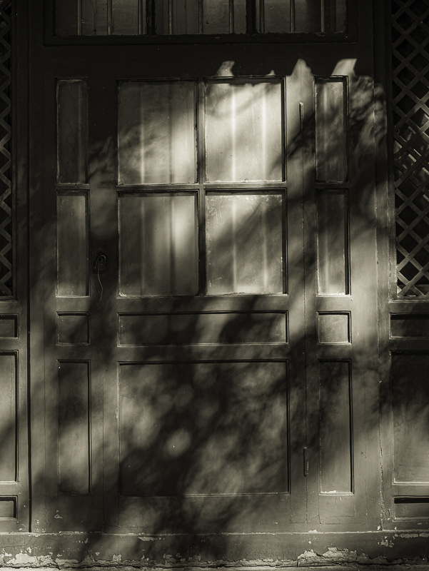
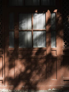
Original digital captureWhat I saw that I liked:Lovely shadows on a door in China. What I don't like in the picture:To say I don't like the color version would be too strong. I'm just not sure the color is adding much to my original response. What I learned:A question that I find invaluable when thinking through the processing choices is: What is this picture about? There is no question in my mind that this image is all about the shadows and the dappled light. With that in mind, the red colors in the above draw our attention away from the shadows. I've never used this image in a project and I think I would be happy to use either one. The final decision as to which might lie in the rest of the images in the project. Lovely to have such choices. 2nd Chances: What I might try nextI should have rectified the verticals in this image. I will before I use it anywhere in a project. |


