Every Picture Is a Compromise
Lessons from the Also-rans
Most photography websites show the photographer's very best work. Wonderful. But that's not the full story of a creative life. If we want to learn, we'd better pay attention to the images that aren't "greatest hits" and see what lessons they have to offer. Every picture is a compromise — the sum of its parts, optical, technical, visual, emotional, and even cosmic – well, maybe not cosmic, but sometimes spiritual. Success on all fronts is rare. It's ok to learn from those that are not our best.
This is a series about my also-rans, some of which I've been able to improve at bit (i.e., "best effort"), none of which I would consider my best. With each there are lessons worth sharing, so I will.
|
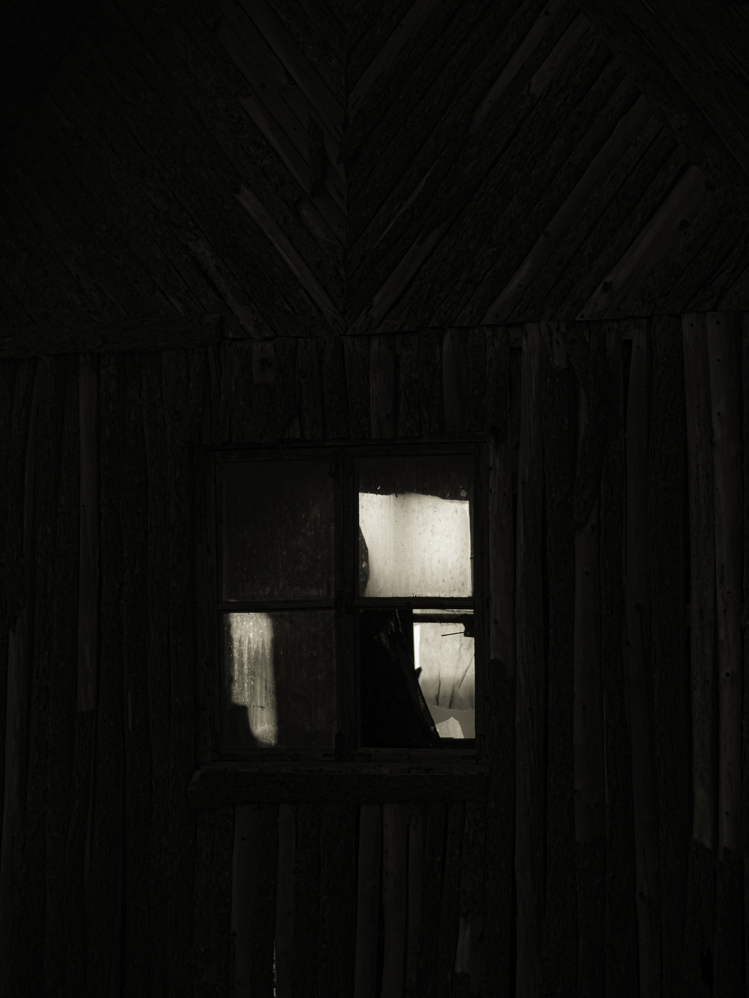
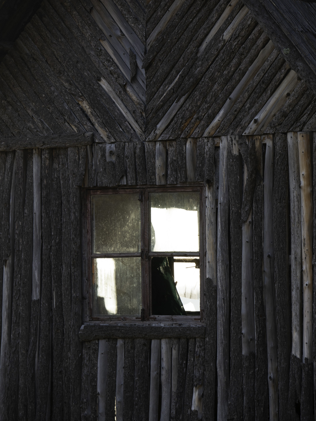
Original digital capture
What I saw that I liked:Curious building, but an obvious HDR candidate. What I don't like in the picture:For HDR purposes, I made two captures of this composition, one for the darker tones in the building and one for the light reflecting off the windows. What I learned:When I looked at the highlight exposure capture (left), I had the sensation that the light was coming in through the windows, not reflecting off them. I like the dark and mysterious feel, but the dark areas were too dark. In the one at left, I skipped the brighter exposure and let go of the HDR plans. Instead, I just pulled a little detail out of the darkest parts of the wall and let that suffice to provide just a hint of texture. Bottom lines is that the one at left is moody, spooky, mysterious, and even intimidating — whereas the one above is a picture of a wall with reflecting windows. 2nd Chances: What I might try nextGetting the dark tones in the image at left to be just right requires some testing. The right amount of shadow detail will depend on whether the image is seen on a light or a dark background, whether it is printed or viewed on screen, whether it is printed on matte or glossy paper. This is a great example of needing several different versions depending on the method of presentation. Thank goodness for Virtual Copies. |