Every Picture Is a Compromise
Lessons from the Also-rans
Most photography websites show the photographer's very best work. Wonderful. But that's not the full story of a creative life. If we want to learn, we'd better pay attention to the images that aren't "greatest hits" and see what lessons they have to offer. Every picture is a compromise — the sum of its parts, optical, technical, visual, emotional, and even cosmic – well, maybe not cosmic, but sometimes spiritual. Success on all fronts is rare. It's ok to learn from those that are not our best.
This is a series about my also-rans, some of which I've been able to improve at bit (i.e., "best effort"), none of which I would consider my best. With each there are lessons worth sharing, so I will.
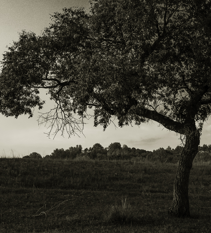
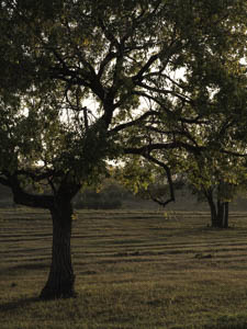
Original digital captureWhat I saw that I liked:I like this photographic idea of the trunk near the edge and the bulk of the tree leaning out in one direction. What I don't like in the picture:The attempt above planted the seed of this idea (no pun intended), but the background obscures the branches. Then there is the cluster of three trees on the right edge. This one was a nice attempt, but not really what I was hoping for. What I learned:Seeds of picture ideas can be almost as good as a successful picture. After I had captured the above, I kept looking for another tree that would allow me to isolate the branches against a sky. It wasn't long before I found the one at left. I wish I could tell you that the barren branch was a keen part of my vision at the time, but it wasn't. I didn't even see it until I was processing the image. 2nd Chances: What I might try nextIt looks to me like there is a problem in the very upper left corner of the image at left. Crunchy processing. I'm going to need to work on that to smooth out those sky tones. |


