Every Picture Is a Compromise
Lessons from the Also-rans
Most photography websites show the photographer's very best work. Wonderful. But that's not the full story of a creative life. If we want to learn, we'd better pay attention to the images that aren't "greatest hits" and see what lessons they have to offer. Every picture is a compromise — the sum of its parts, optical, technical, visual, emotional, and even cosmic – well, maybe not cosmic, but sometimes spiritual. Success on all fronts is rare. It's ok to learn from those that are not our best.
This is a series about my also-rans, some of which I've been able to improve at bit (i.e., "best effort"), none of which I would consider my best. With each there are lessons worth sharing, so I will.
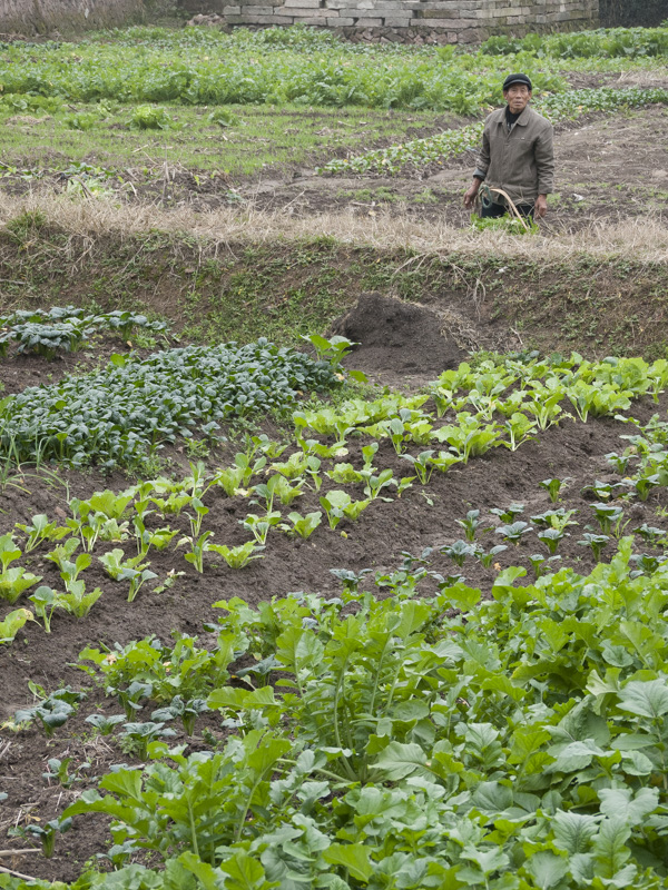
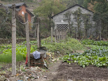
Original digital captureWhat I saw that I liked:The Chinese use every square foot of space they can for growing vegetables. I wanted so show that. What I don't like in the picture:The image above shows the space, but not the life. No people. What I learned:The one at left is a different plot and I wish it had more of a sense of the building that surrounded this garden. At least it has a person it it. I never did get the combination in one image. Too bad. 2nd Chances: What I might try nextThis might be a case where a triptych could do the job. I need to try that. |


