Every Picture Is a Compromise
Lessons from the Also-rans
Most photography websites show the photographer's very best work. Wonderful. But that's not the full story of a creative life. If we want to learn, we'd better pay attention to the images that aren't "greatest hits" and see what lessons they have to offer. Every picture is a compromise — the sum of its parts, optical, technical, visual, emotional, and even cosmic – well, maybe not cosmic, but sometimes spiritual. Success on all fronts is rare. It's ok to learn from those that are not our best.
This is a series about my also-rans, some of which I've been able to improve at bit (i.e., "best effort"), none of which I would consider my best. With each there are lessons worth sharing, so I will.
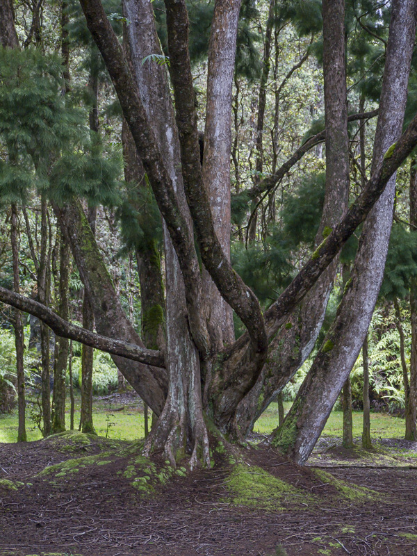
Original digital captureWhat I saw that I liked:Lovely old tree in a Hawaiian garden. What I don't like in the picture:Bright things in the back ground I always find distracting. That grass just beyond the trees ruin this image. I should just delete it an forget about it. What I learned:Or — as I've repeated over and over again — never delete an image. You never know what you might be able to do with it in the future. Nor can you predict what software improvements will provide an easy fix. In this case, Adobe added a "range mask" option in Lightroom which was the perfect tool I needed for this image. Still not stellar, but way better than with that bright grass in the background! 2nd Chances: What I might try nextI think this one needs a little more finessing and fine-tuning. I could desaturate that grass a bit so it isn't quite so green. A few of the ferns in the background could use toning down. At least I now have the tool to accomplish all this easily. |


