Every Picture Is a Compromise
Lessons from the Also-rans
Most photography websites show the photographer's very best work. Wonderful. But that's not the full story of a creative life. If we want to learn, we'd better pay attention to the images that aren't "greatest hits" and see what lessons they have to offer. Every picture is a compromise — the sum of its parts, optical, technical, visual, emotional, and even cosmic – well, maybe not cosmic, but sometimes spiritual. Success on all fronts is rare. It's ok to learn from those that are not our best.
This is a series about my also-rans, some of which I've been able to improve at bit (i.e., "best effort"), none of which I would consider my best. With each there are lessons worth sharing, so I will.
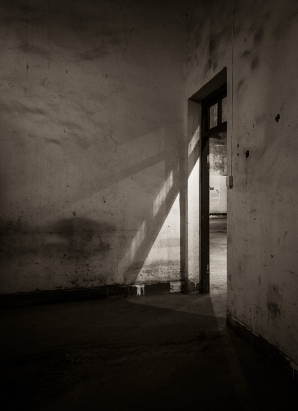
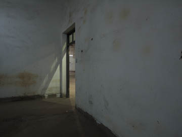
Original digital captureWhat I saw that I liked:Very cool light coming in through the door of this abandoned factory, now an art gallery! In China. What I don't like in the picture:The green cast from the industrial lights has got to go. What I learned:Elsewhere I've advised that making both a horizontal and a vertical composition can save your bacon later. It's ok to postpone the final decision as to which you'll use. Here is an example of where I've done just that. 2nd Chances: What I might try nextI still think I might use the horizontal one someday, somewhere. To repeat, it's ok to postpone the final decision as to which you'll use — because the answer might be that you use both of them! |


