Every Picture Is a Compromise
Lessons from the Also-rans
Most photography websites show the photographer's very best work. Wonderful. But that's not the full story of a creative life. If we want to learn, we'd better pay attention to the images that aren't "greatest hits" and see what lessons they have to offer. Every picture is a compromise — the sum of its parts, optical, technical, visual, emotional, and even cosmic – well, maybe not cosmic, but sometimes spiritual. Success on all fronts is rare. It's ok to learn from those that are not our best.
This is a series about my also-rans, some of which I've been able to improve at bit (i.e., "best effort"), none of which I would consider my best. With each there are lessons worth sharing, so I will.
Previous image | Next image |
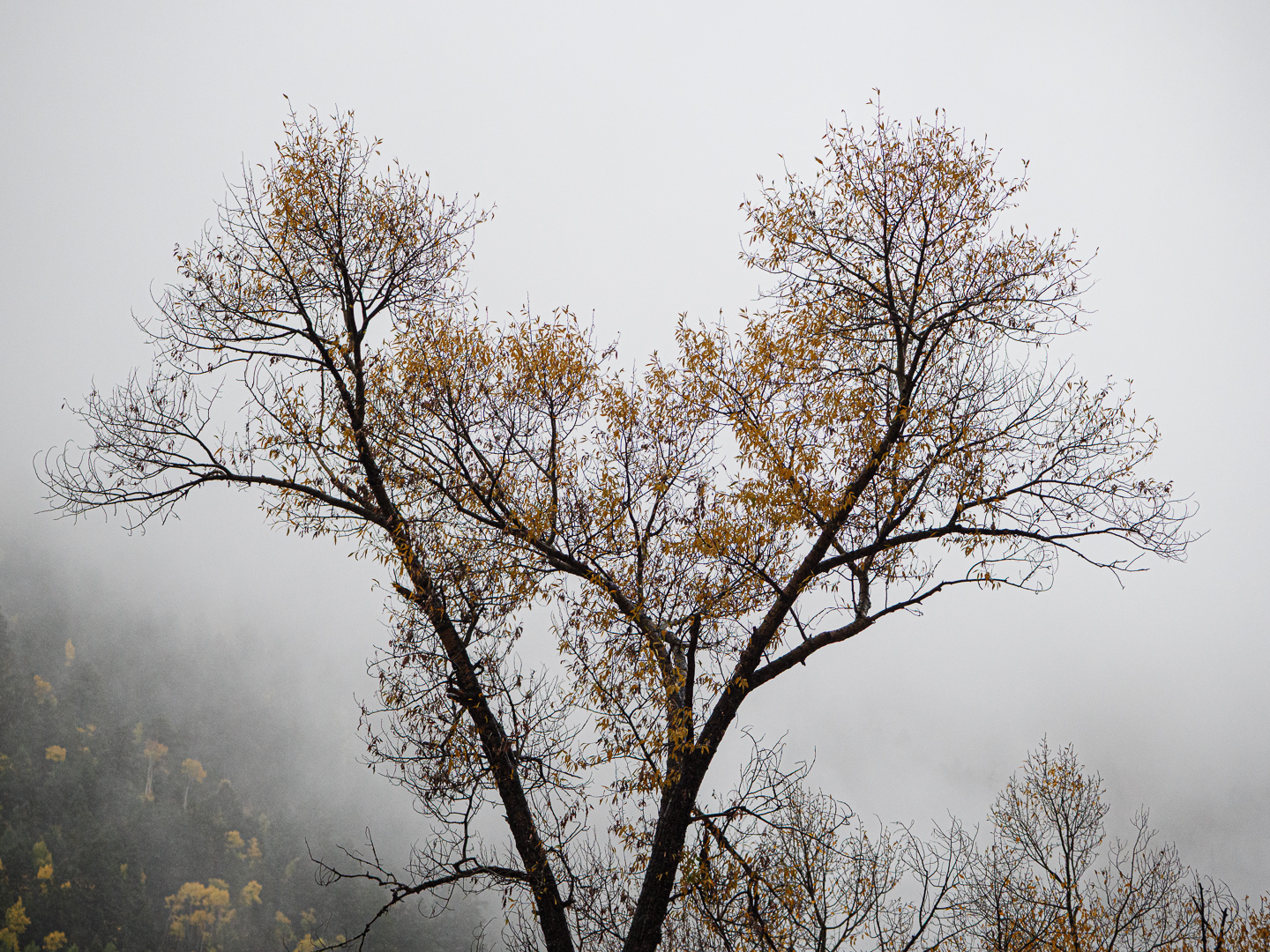
Original digital capture

Yellow Plus
Fall colors are a favorite for many photographers, myself included. Eventually, however, splashes of yellow after splashes of yellow can get a little repetitious. That's when to start looking for some additional element that goes beyond more or more intense yellows. One of my favorite plus elements is atmosphere — clouds, mist, fog, haze — anything that makes the air visible. As Jay Maisel said, "Never trust air you can't see."
What I saw that I liked:
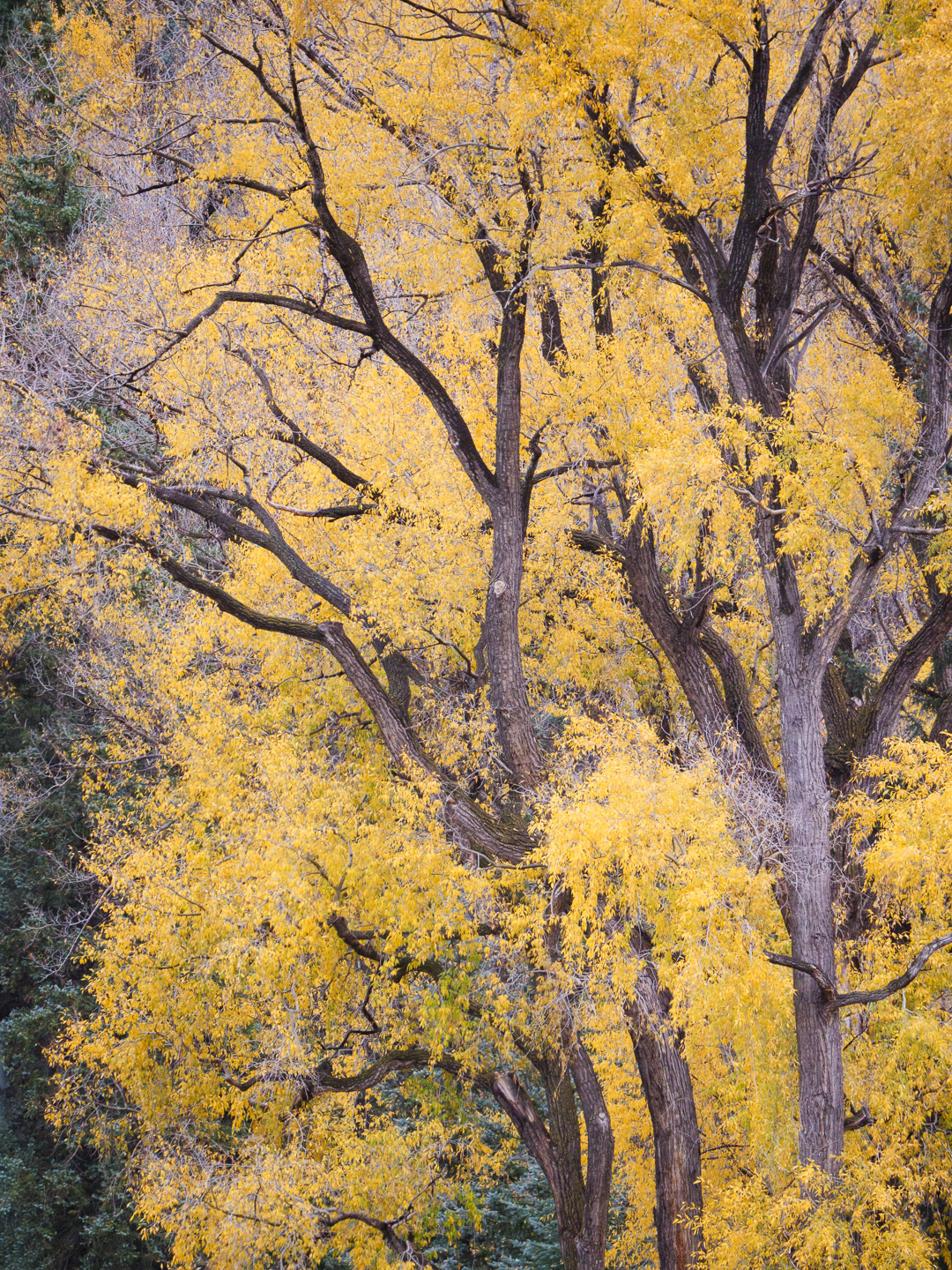
The overpowering yellow in the image above is wonderful. but . . .
What I don't like in the picture:
The image at left appeals me because the fall colors are there and we know it from those dots of yellow in the lower left corner.
What I learned:
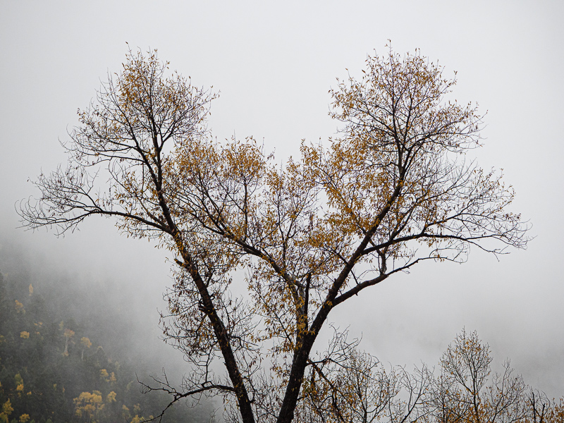
The way the main tree stands out against the fog is what makes this image a success. To express the fall colors, we don't always need to overwhelm the viewer's eye with color. |
|