Every Picture Is a Compromise
Lessons from the Also-rans
Most photography websites show the photographer's very best work. Wonderful. But that's not the full story of a creative life. If we want to learn, we'd better pay attention to the images that aren't "greatest hits" and see what lessons they have to offer. Every picture is a compromise — the sum of its parts, optical, technical, visual, emotional, and even cosmic – well, maybe not cosmic, but sometimes spiritual. Success on all fronts is rare. It's ok to learn from those that are not our best.
This is a series about my also-rans, some of which I've been able to improve at bit (i.e., "best effort"), none of which I would consider my best. With each there are lessons worth sharing, so I will.
Previous image | Next image |
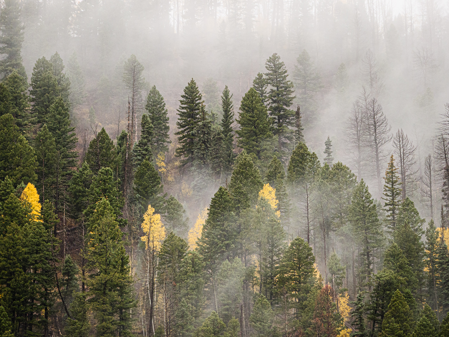
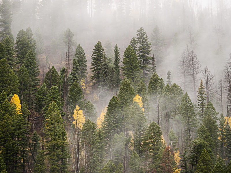
Original digital capture
Yellow Plus
Fall colors are a favorite for many photographers, myself included. Eventually, however, splashes of yellow after splashes of yellow can get a little repetitious. That's when to start looking for some additional element that goes beyond more or more intense yellows. One of my favorite plus elements is atmosphere — clouds, mist, fog, haze — anything that makes the air visible. As Jay Maisel said, "Never trust air you can't see."
What I saw that I liked:
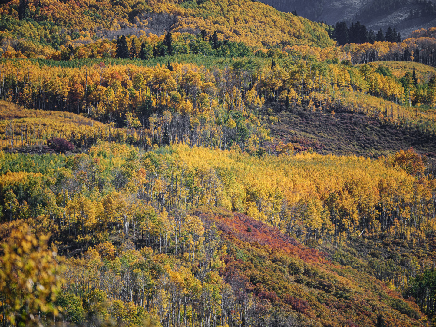
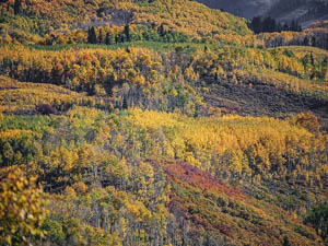
When the fall colors pop out in mass, we photographers pull out our cameras with a smile. Just gorgeous!
What I don't like in the picture:
Truth be told, I really like all the images of fall colors this week. There is, we must be frank, a limit on how many pictures of yellow leaves we need to see.
What I learned:
I've come to realize that the key to avoid the sense of needless repetition is to introduce in our compositions an additional element beyond the fall colors. Variety is the spice of photography, too.
In the image at left, the accent of yellow here and there is just lovely. That and the mist make an image that is not just about yellow. |
|