Every Picture Is a Compromise
Lessons from the Also-rans
Most photography websites show the photographer's very best work. Wonderful. But that's not the full story of a creative life. If we want to learn, we'd better pay attention to the images that aren't "greatest hits" and see what lessons they have to offer. Every picture is a compromise — the sum of its parts, optical, technical, visual, emotional, and even cosmic – well, maybe not cosmic, but sometimes spiritual. Success on all fronts is rare. It's ok to learn from those that are not our best.
This is a series about my also-rans, some of which I've been able to improve at bit (i.e., "best effort"), none of which I would consider my best. With each there are lessons worth sharing, so I will.
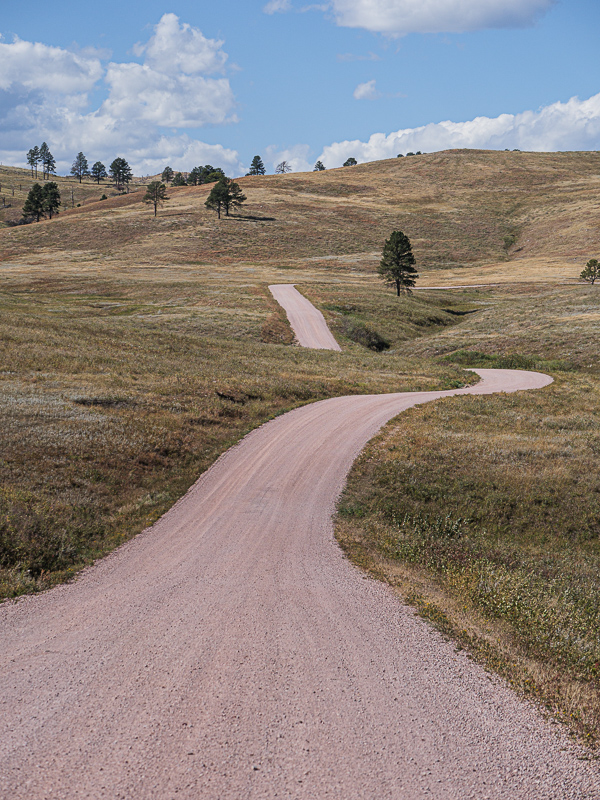
Original digital captureWhat I saw that I liked:Compositions that rely heavily on perspective and leading lines are powerful tools to direct our eye. What I learned:Normally when we think of perspective, we think of a line on the left and a line on the right getting closer to each other at the far end of the scene. The image at left is an example of that. That's not the only kind of perspective lines, however. In the above example, there is only the left line that draws our eye in. It's more like a pointer than it is like a path. I think of these compositions as "one-sided perspective." I'm not aware of any hard and fast rules about which to use when, but in general I find full perspective is more common in the landscape and one-sided perspective is more common in architecture. Just some food for thought. |


