Every Picture Is a Compromise
Lessons from the Also-rans
Most photography websites show the photographer's very best work. Wonderful. But that's not the full story of a creative life. If we want to learn, we'd better pay attention to the images that aren't "greatest hits" and see what lessons they have to offer. Every picture is a compromise — the sum of its parts, optical, technical, visual, emotional, and even cosmic – well, maybe not cosmic, but sometimes spiritual. Success on all fronts is rare. It's ok to learn from those that are not our best.
This is a series about my also-rans, some of which I've been able to improve at bit (i.e., "best effort"), none of which I would consider my best. With each there are lessons worth sharing, so I will.
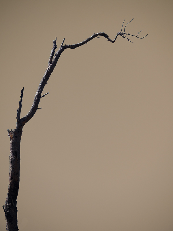
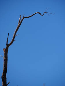
Original digital captureWhat I saw that I liked:Always a fan of minimalism. What I don't like in the picture:I know, skies are blue. They are always blue. Other than clouds and smoke, they will always be blue. And therefore they should be blue in a photograph? Why? What I learned:Why? Seriously, in artmaking, why is it important that we represent color accurately? And isn't the "blueness" of the sky a function of how human eyeballs work? In artmaking, emotion always trumps accuracy. In making the color variant at left, I kept thinking about the wildfires that have plagued the West in recent years. In fact, this burnt tree is likely the result of fire. Why not colorize the image to fit the mood and my emotional state of being at the moment? Isn't the image more powerful with the smoky looking sky than with a bald, blue — but accurate — sky in the above? 2nd Chances: What I might try nextI wanted the tree to be in color, hence my decision to colorize this one via white balance manipulations rather than to convert the colors to a toned b/w. I should probably look at it as a toned b/w just to be sure. |


