Every Picture Is a Compromise
Lessons from the Also-rans
Most photography websites show the photographer's very best work. Wonderful. But that's not the full story of a creative life. If we want to learn, we'd better pay attention to the images that aren't "greatest hits" and see what lessons they have to offer. Every picture is a compromise — the sum of its parts, optical, technical, visual, emotional, and even cosmic – well, maybe not cosmic, but sometimes spiritual. Success on all fronts is rare. It's ok to learn from those that are not our best.
This is a series about my also-rans, some of which I've been able to improve at bit (i.e., "best effort"), none of which I would consider my best. With each there are lessons worth sharing, so I will.
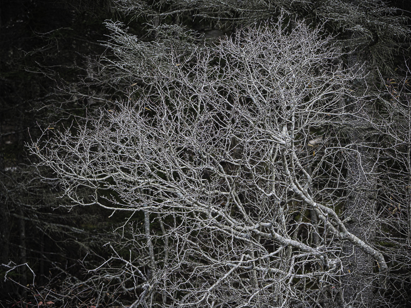
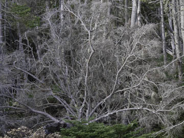
Original digital captureWhat I saw that I liked:White branches that form a pattern in the tree. What I don't like in the picture:The one above is very fan-shaped, and I like it. It wouldn't wear well over time, I'm afraid, because it is a bit too bilaterally symmetric. I'm just not fond of such balanced compositions. What I learned:The version at left was right next to the one above, but leans in from the right side with a balance and even grace that I could enjoy for a long while. I particularly like that accidental circle in the extreme lower left corner. It adds a point of counter balance to the massive tree above it. 2nd Chances: What I might try nextThere might be a few stray branches I should clone out before I consider this a finished composition. |


