Every Picture Is a Compromise
Lessons from the Also-rans
Most photography websites show the photographer's very best work. Wonderful. But that's not the full story of a creative life. If we want to learn, we'd better pay attention to the images that aren't "greatest hits" and see what lessons they have to offer. Every picture is a compromise — the sum of its parts, optical, technical, visual, emotional, and even cosmic – well, maybe not cosmic, but sometimes spiritual. Success on all fronts is rare. It's ok to learn from those that are not our best.
This is a series about my also-rans, some of which I've been able to improve at bit (i.e., "best effort"), none of which I would consider my best. With each there are lessons worth sharing, so I will.
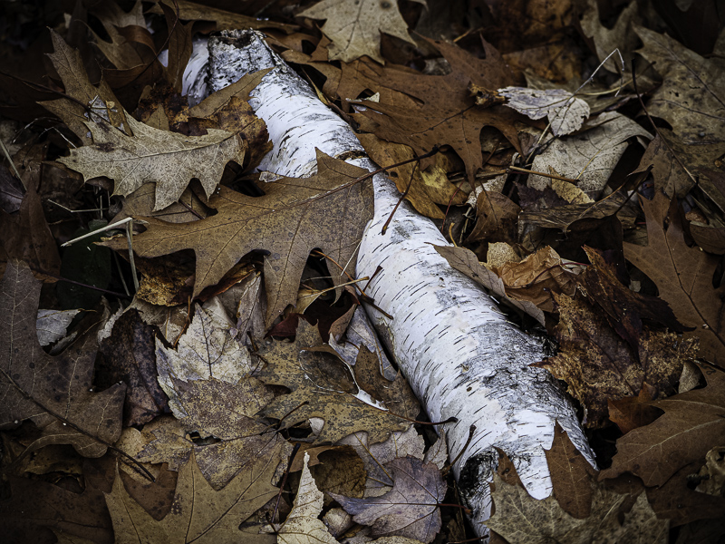
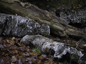
Original digital captureWhat I saw that I liked:The white of the fallen beech against the fall leaves. What I don't like in the picture:The first attempt above was clearly a mistake. Too confusing, the log at the top is distracting, the bottom is out of focus, and the two beech logs are disjointed. Why, oh why, did I even click the shutter on this one? What I learned:You can never go wrong with a simpler composition — unless you are purposely trying to show chaos. I wasn't, so the simpler version at left is far better, at least for the way I was seeing it in the field. 2nd Chances: What I might try nextJust in case you were wondering, this is a 7-image focus stack to get it all sharp using a tripod-based camera that was pointing down about 45°. |


