Every Picture Is a Compromise
Lessons from the Also-rans
Most photography websites show the photographer's very best work. Wonderful. But that's not the full story of a creative life. If we want to learn, we'd better pay attention to the images that aren't "greatest hits" and see what lessons they have to offer. Every picture is a compromise — the sum of its parts, optical, technical, visual, emotional, and even cosmic – well, maybe not cosmic, but sometimes spiritual. Success on all fronts is rare. It's ok to learn from those that are not our best.
This is a series about my also-rans, some of which I've been able to improve at bit (i.e., "best effort"), none of which I would consider my best. With each there are lessons worth sharing, so I will.
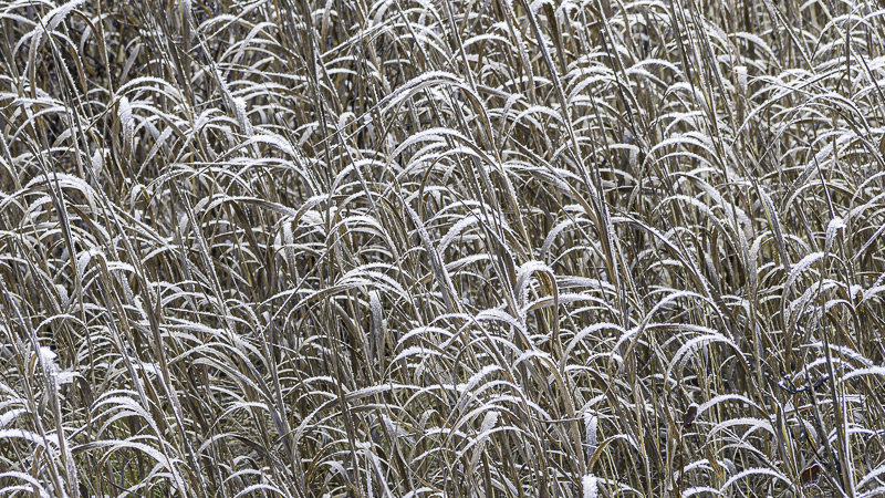
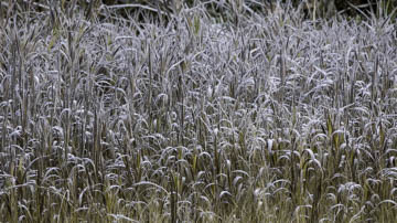
Original digital captureWhat I saw that I liked:I always love the challenge of bringing visual order to the chaos of the nature. A day in eastern Oregon with a tremendous hoar frost. What I don't like in the picture:The image above has three horizontal bands of content. At the top there is a dark out of focus band; the middle has some lighter tones without color; the bottom band is the area that works with both color and texture. What I learned:Better to concentrate on one area and emphasize the repeating patterns of nature as you see in the image at left. To my eye, it's not a contest as to which one I prefer in telling the story of this hoar frost day. 2nd Chances: What I might try nextI need to print this one. It might be a challenge to get those tones just right in a print. |


