Every Picture Is a Compromise
Lessons from the Also-rans
Most photography websites show the photographer's very best work. Wonderful. But that's not the full story of a creative life. If we want to learn, we'd better pay attention to the images that aren't "greatest hits" and see what lessons they have to offer. Every picture is a compromise — the sum of its parts, optical, technical, visual, emotional, and even cosmic – well, maybe not cosmic, but sometimes spiritual. Success on all fronts is rare. It's ok to learn from those that are not our best.
This is a series about my also-rans, some of which I've been able to improve at bit (i.e., "best effort"), none of which I would consider my best. With each there are lessons worth sharing, so I will.
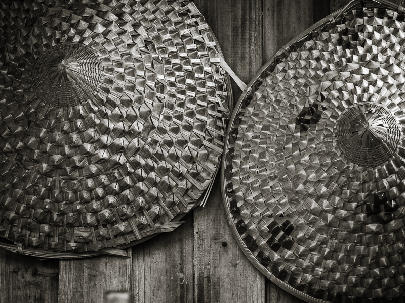
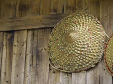
Original digital captureWhat I saw that I liked:Again in rural China. Love these large straw hats. This is not a showplace or a museum. This was in a farm that means these are real hats, worn by real people, on a real farm. What I don't like in the picture:The one above was my attempt to get the entire hat in the frame. Pretty awful, especially with all that wasted space on the left. What I learned:It's not necessary to show the entire object. After recomposing at the above location, just a bit to the right rendered the image at left. Do you need to see the entire hat to know that it is round? Of course, not. 2nd Chances: What I might try nextWhatever that is that is out of focus in the lower edge, left of center has got to go. Generative Fill for sure. |


