Every Picture Is a Compromise
Lessons from the Also-rans
Most photography websites show the photographer's very best work. Wonderful. But that's not the full story of a creative life. If we want to learn, we'd better pay attention to the images that aren't "greatest hits" and see what lessons they have to offer. Every picture is a compromise — the sum of its parts, optical, technical, visual, emotional, and even cosmic – well, maybe not cosmic, but sometimes spiritual. Success on all fronts is rare. It's ok to learn from those that are not our best.
This is a series about my also-rans, some of which I've been able to improve at bit (i.e., "best effort"), none of which I would consider my best. With each there are lessons worth sharing, so I will.


Previous image | Next image |
Original digital capture

South Dakota Week
On a recent trip, I had a chance to photograph in Custer State Park in South Dakota. I'm not real thrilled at the images I captured there, so an ideal time to discuss a few failures and their possible improvements.
What I saw that I liked:
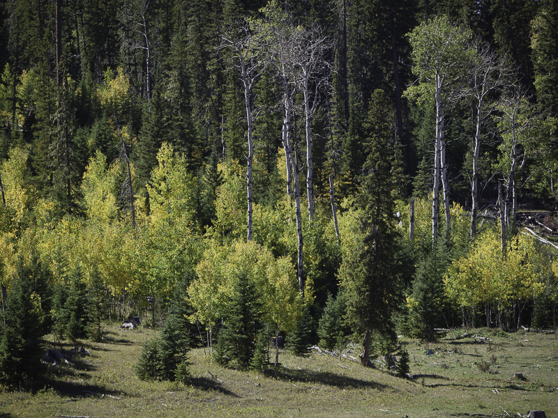
Another splash of color.
What I don't like in the picture:
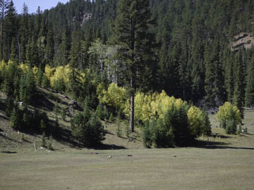
At first, I thought the tall fir tree should be in the center, but I don't like this composition now because of the blue sky in the upper left and the rock in the upper right.
What I learned:
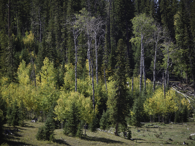
I drove a few yards down the road and made the image on the left top. Cut off the tops of the two birch trees. Damn.
Recompose and try again. Third time was a charm. The image left/bottom is the one for sure.
2nd Chances: What I might try next
This could be a larger print than my average. I'll have to try that. |
|

