Every Picture Is a Compromise
Lessons from the Also-rans
Most photography websites show the photographer's very best work. Wonderful. But that's not the full story of a creative life. If we want to learn, we'd better pay attention to the images that aren't "greatest hits" and see what lessons they have to offer. Every picture is a compromise — the sum of its parts, optical, technical, visual, emotional, and even cosmic – well, maybe not cosmic, but sometimes spiritual. Success on all fronts is rare. It's ok to learn from those that are not our best.
This is a series about my also-rans, some of which I've been able to improve at bit (i.e., "best effort"), none of which I would consider my best. With each there are lessons worth sharing, so I will.

Previous image | Next image |
Original digital capture

High Contrast Week
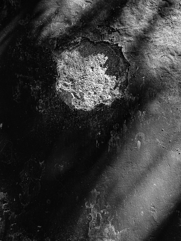
Sometimes the light is just flat and downright discouraging. Fortunately, we need not accept that flat contrast as is. Pushing the contrast of an image to extremes can often salvage what looks like a weak image into a strong one. This week is an exploration of turning low contrast failures into high contrast successes.
What I saw that I liked:
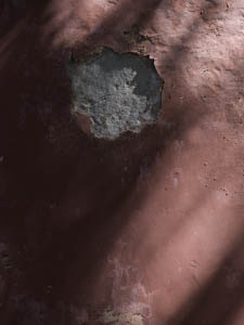
Shadows, but the truth is that this was at a temple in Beijing and I was photographing anything that caught my eye, even dumb stuff like this. Yes, I admit, a touch of "spray and pray."
What I don't like in the picture:
How can I possibly explain why I snapped this picture? Busted cement wall painted weak red with a few shadows. Is this photographic subject matter?
What I learned:
It might be an exaggeration to say that every single loser in your collection should be examined in high contrast mode, but then again I've found so many interesting image that way that I'm tempted to advise it. I don't know that I'll ever use this image anywhere, but at lest I won't delete it from my catalog; someday I might find it is the perfect image for a project. At least as a high contrast image it's better than the weak red above. |
|


