Every Picture Is a Compromise
Lessons from the Also-rans
Most photography websites show the photographer's very best work. Wonderful. But that's not the full story of a creative life. If we want to learn, we'd better pay attention to the images that aren't "greatest hits" and see what lessons they have to offer. Every picture is a compromise — the sum of its parts, optical, technical, visual, emotional, and even cosmic – well, maybe not cosmic, but sometimes spiritual. Success on all fronts is rare. It's ok to learn from those that are not our best.
This is a series about my also-rans, some of which I've been able to improve at bit (i.e., "best effort"), none of which I would consider my best. With each there are lessons worth sharing, so I will.

Previous image | Next image |
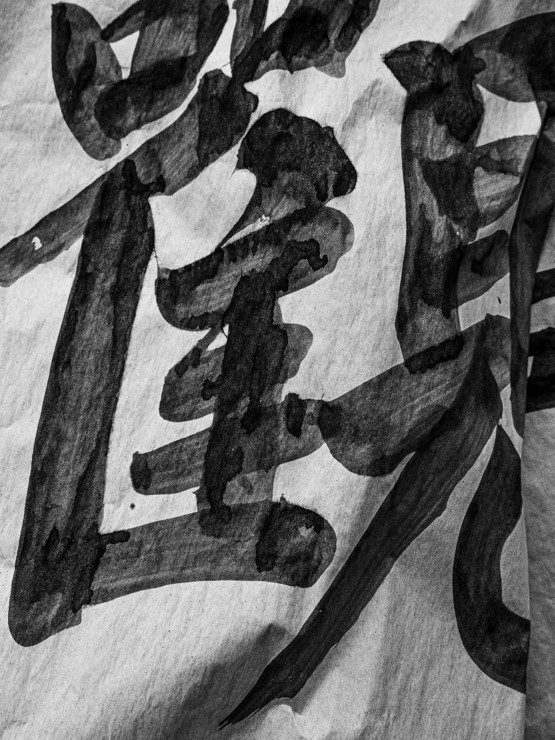
Original digital capture
High Contrast Week
Sometimes the light is just flat and downright discouraging. Fortunately, we need not accept that flat contrast as is. Pushing the contrast of an image to extremes can often salvage what looks like a weak image into a strong one. This week is an exploration of turning low contrast failures into high contrast successes.
What I saw that I liked:
This is the same street vendor location that started my weekly series, Finding the Picture over at www.lensworkonline.com, our membership website.
What I don't like in the picture:
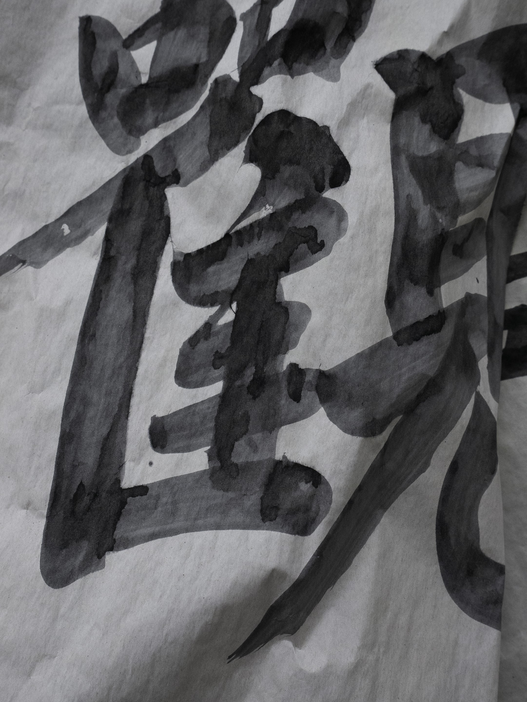
In the above, the calligraphy is fun, but gray. The paper is gray. Gray, gray, gray — and not a good gray.
What I learned:
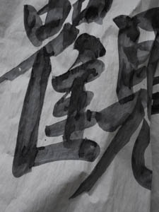
Here again, an increase in contrast brings out detail that are almost invisible in the above. I'm still not crazy about the composition of this image, but it does illustrate the value of pushing contrast just to see if anything fun happens to a gray original. |
|