Every Picture Is a Compromise
Lessons from the Also-rans
Most photography websites show the photographer's very best work. Wonderful. But that's not the full story of a creative life. If we want to learn, we'd better pay attention to the images that aren't "greatest hits" and see what lessons they have to offer. Every picture is a compromise — the sum of its parts, optical, technical, visual, emotional, and even cosmic – well, maybe not cosmic, but sometimes spiritual. Success on all fronts is rare. It's ok to learn from those that are not our best.
This is a series about my also-rans, some of which I've been able to improve at bit (i.e., "best effort"), none of which I would consider my best. With each there are lessons worth sharing, so I will.
|
Original digital capture
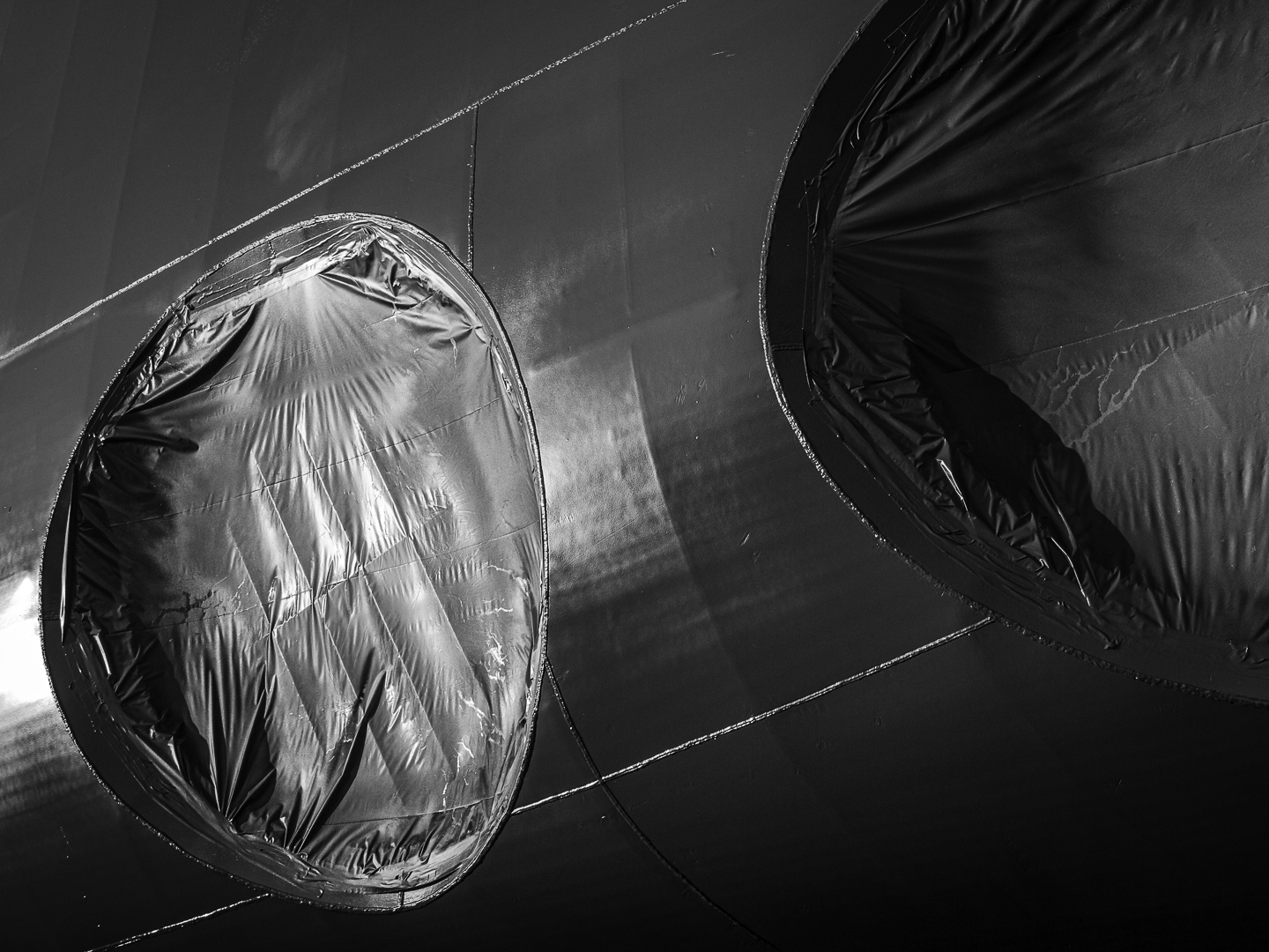
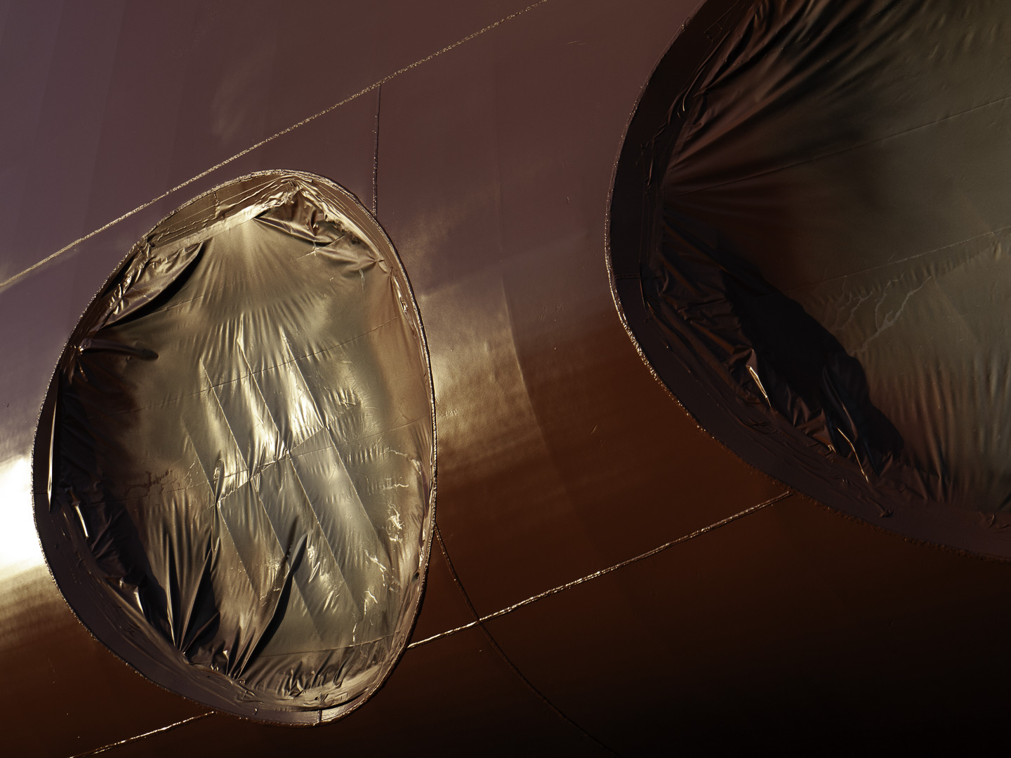
Black and White Weekat the Dakota Creek shipyard The opportunities to photograph in color are everywhere. We see in color. All our RAW captures are in color. What are the decisions that lead to a b/w photograph? This week will feature 5 compositions that ended up as b/w images even though the color originals could have worked, too. What I saw that I liked:This shot is clearly about the sheen on the plastic covering these bow truster holes during the primer paint application. (The red is the primer paint.) What I don't like in the picture:Because I wanted attention focused on the plastic sheen, it was an easy decision to drop out the red by doing a b/w conversion. If the color isn't important, eliminate it. What I learned:Here again I chose to do the conversion using a profile that did the heavy work on the b/w conversion. In this case, I used the Blue Filter profile and then tweaked the tones that weren't just exactly right. |