Every Picture Is a Compromise
Lessons from the Also-rans
Most photography websites show the photographer's very best work. Wonderful. But that's not the full story of a creative life. If we want to learn, we'd better pay attention to the images that aren't "greatest hits" and see what lessons they have to offer. Every picture is a compromise — the sum of its parts, optical, technical, visual, emotional, and even cosmic – well, maybe not cosmic, but sometimes spiritual. Success on all fronts is rare. It's ok to learn from those that are not our best.
This is a series about my also-rans, some of which I've been able to improve at bit (i.e., "best effort"), none of which I would consider my best. With each there are lessons worth sharing, so I will.
|
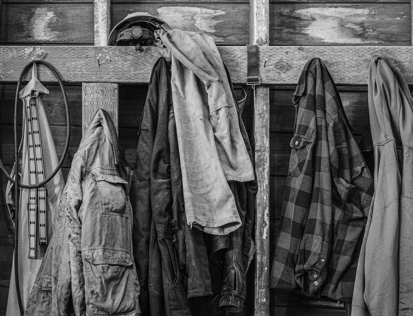
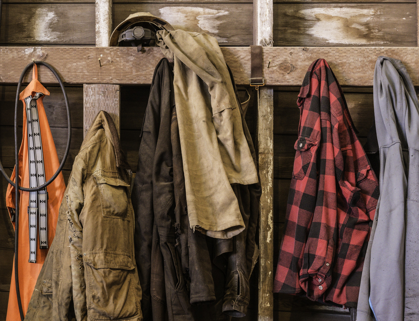
Original digital capture
Black and White Weekat the Dakota Creek shipyard The opportunities to photograph in color are everywhere. We see in color. All our RAW captures are in color. What are the decisions that lead to a b/w photograph? This week will feature 5 compositions that ended up as b/w images even though the color originals could have worked, too. What I saw that I liked:Whenever I can humanize a place like this, I love how those photographs in a project bring it to life. What I don't like in the picture:There are two distracting colors in this image that take our attention away from the coats. The orange at the left edge and the red on the right edge are not helping. What I learned:Converting to b/w eliminates the distractions. In that conversion, however, are also the roots of luminance control that can change the relationship of the tones in gray scale. I used the Green Filter profile in the conversion process to reduce the luminance of both the orange and red original colors. Much better. |