Every Picture Is a Compromise
Lessons from the Also-rans
Most photography websites show the photographer's very best work. Wonderful. But that's not the full story of a creative life. If we want to learn, we'd better pay attention to the images that aren't "greatest hits" and see what lessons they have to offer. Every picture is a compromise — the sum of its parts, optical, technical, visual, emotional, and even cosmic – well, maybe not cosmic, but sometimes spiritual. Success on all fronts is rare. It's ok to learn from those that are not our best.
This is a series about my also-rans, some of which I've been able to improve at bit (i.e., "best effort"), none of which I would consider my best. With each there are lessons worth sharing, so I will.

Previous image | Next image |
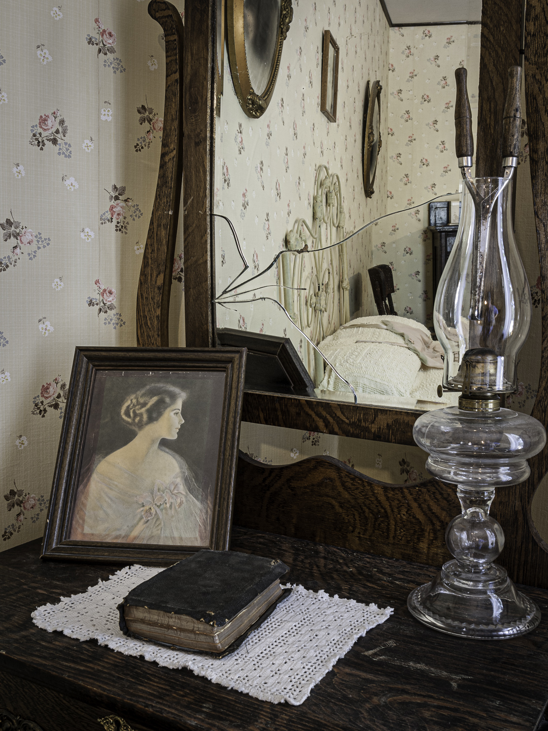
Original digital capture
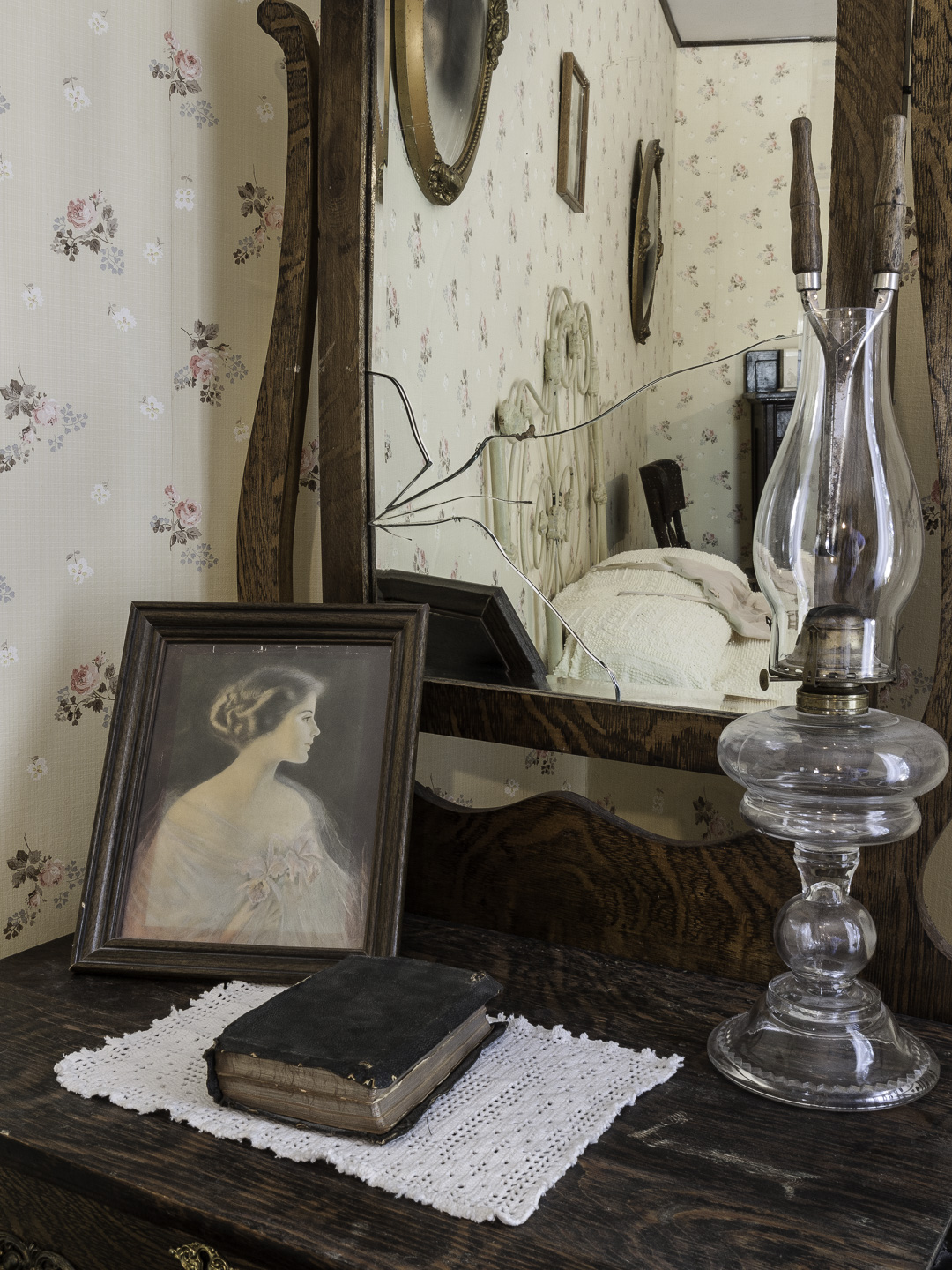
Divided Composition
Most photographs are composed with some central subject seen against a background or a foreground. A much more rare kind of composition is when two sections of the composition almost seem like they are from different exposures. These "divided compositions" are a great technique for drawing comparisons.
What I saw that I liked:
Reflection in the mirror that makes a natural divided composition. The reflection is a composition within a composition.
What I don't like in the picture:
I wish I could figure out a way to make the crack in the mirror more of a feature. Also, I don't think the kerosene lamp is adding anything. I could have moved it out of the composition had I thought of that while I was there. Maybe Generative Fill?
What I learned:
Perhaps there is nor more famous image than The Arnolfini Portrait by the 15th century Dutch painter Jan van Eyck that uses this trick of the mirror in the composition to show objects that we otherwise couldn't see. If it's good enough for him, why not for us photographers here in the 21st century?
2nd Chances: What I might try next
I think I need to explore the color balance options in this image. What you see here is the results of "auto white balance." Maybe that's not the best choice for this indoor image. |
|