Every Picture Is a Compromise
Lessons from the Also-rans
Most photography websites show the photographer's very best work. Wonderful. But that's not the full story of a creative life. If we want to learn, we'd better pay attention to the images that aren't "greatest hits" and see what lessons they have to offer. Every picture is a compromise — the sum of its parts, optical, technical, visual, emotional, and even cosmic – well, maybe not cosmic, but sometimes spiritual. Success on all fronts is rare. It's ok to learn from those that are not our best.
This is a series about my also-rans, some of which I've been able to improve at bit (i.e., "best effort"), none of which I would consider my best. With each there are lessons worth sharing, so I will.
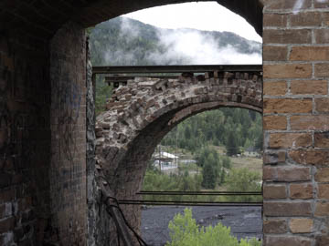
Previous image | Next image |
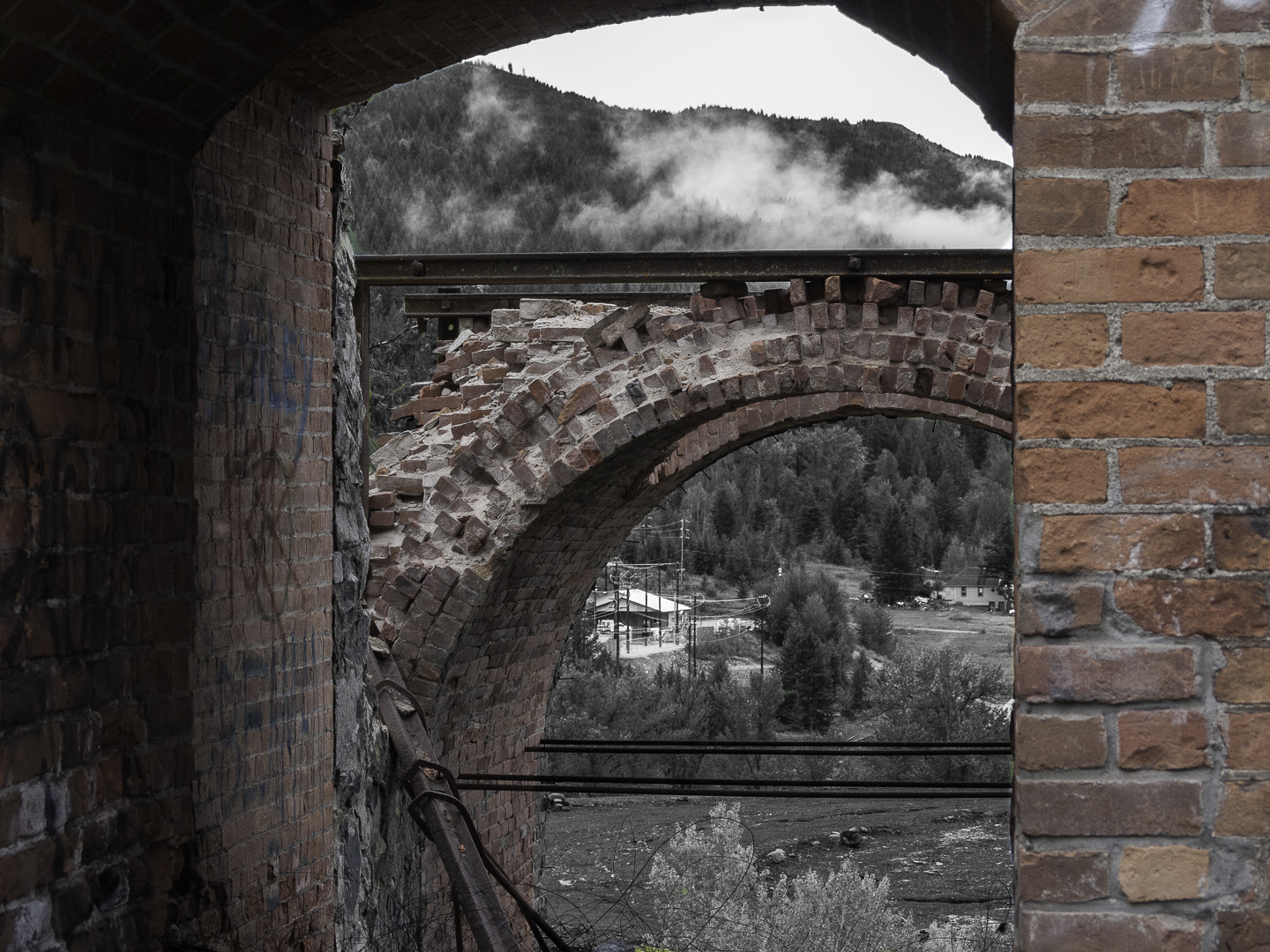
Original digital capture
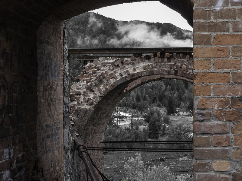
Divided Composition
Most photographs are composed with some central subject seen against a background or a foreground. A much more rare kind of composition is when two sections of the composition almost seem like they are from different exposures. These "divided compositions" are a great technique for drawing comparisons.
What I saw that I liked:
Looking through is another way of creating a divided composition.
What I don't like in the picture:
In the above, the perspective I used does not emphasize the layers, in fact, it flattens the image.
What I learned:
That doesn't mean, however, that I can't use a bit of processing to separate the foreground from the background. By converting the entire background to b/w and leaving the brick structures in full color, I was able to create a more divided composition.
2nd Chances: What I might try next
Should I punch up the saturation in the bricks to enhance the division even more? |
|