Every Picture Is a Compromise
Lessons from the Also-rans
Most photography websites show the photographer's very best work. Wonderful. But that's not the full story of a creative life. If we want to learn, we'd better pay attention to the images that aren't "greatest hits" and see what lessons they have to offer. Every picture is a compromise — the sum of its parts, optical, technical, visual, emotional, and even cosmic – well, maybe not cosmic, but sometimes spiritual. Success on all fronts is rare. It's ok to learn from those that are not our best.
This is a series about my also-rans, some of which I've been able to improve at bit (i.e., "best effort"), none of which I would consider my best. With each there are lessons worth sharing, so I will.

Previous image | Next image |
Original digital capture

Architectural Tourist Week
This week I'm looking at image made while touring historic buildings and their interiors. Dark, three-dimmensional, and cramped subjects imply using high ISO, focus stacking, and with tripods not allowed, these are all handheld. Very technically challenging subjects. It is very fun to overcome these difficulties and end up with images that I'd be happy to show anyone.
What I saw that I liked:
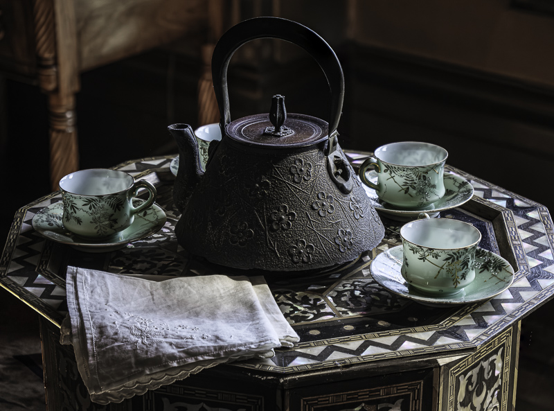
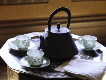
Lovely Japanese teapot.
What I don't like in the picture:
Because it is back lit, there is no visible detail on the surface. Too bad, because it was great.
What I learned:
Rather than fight the troublesome light in this above, I decided to just change my angle of approach a little to the right. The teapot texture is now visible, I pulled out some more by raising the shadow values, and reduced the wood in the background to a less intense color. This all required, Enhanced Noise Reduction, focus stacking, shadow lifting and a little Generative Fill to eliminate a couple of distracting elements. |
|


