Every Picture Is a Compromise
Lessons from the Also-rans
Most photography websites show the photographer's very best work. Wonderful. But that's not the full story of a creative life. If we want to learn, we'd better pay attention to the images that aren't "greatest hits" and see what lessons they have to offer. Every picture is a compromise — the sum of its parts, optical, technical, visual, emotional, and even cosmic – well, maybe not cosmic, but sometimes spiritual. Success on all fronts is rare. It's ok to learn from those that are not our best.
This is a series about my also-rans, some of which I've been able to improve at bit (i.e., "best effort"), none of which I would consider my best. With each there are lessons worth sharing, so I will.

Previous image | Next image |
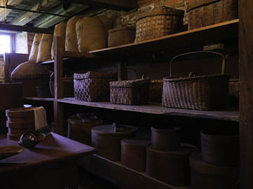
Original digital capture

Architectural Tourist Week
This week I'm looking at image made while touring historic buildings and their interiors. Dark, three-dimmensional, and cramped subjects imply using high ISO, focus stacking, and with tripods not allowed, these are all handheld. Very technically challenging subjects. It is very fun to overcome these difficulties and end up with images that I'd be happy to show anyone.
What I saw that I liked:
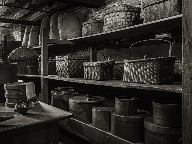
In the basement. Lovely baskets.
What I don't like in the picture:
Awful window.
What I learned:
Like the previous image, I first ran all the images through Enhanced Noise Reduction, then did the focus stack merge. So far, so good. As to that window in the upper left, I sent the image back to Photoshop and did a Generative Fill to eliminate that entire upper corner in the above image. Pretty damn convincing, if you ask me. |
|


