Every Picture Is a Compromise
Lessons from the Also-rans
Most photography websites show the photographer's very best work. Wonderful. But that's not the full story of a creative life. If we want to learn, we'd better pay attention to the images that aren't "greatest hits" and see what lessons they have to offer. Every picture is a compromise — the sum of its parts, optical, technical, visual, emotional, and even cosmic – well, maybe not cosmic, but sometimes spiritual. Success on all fronts is rare. It's ok to learn from those that are not our best.
This is a series about my also-rans, some of which I've been able to improve at bit (i.e., "best effort"), none of which I would consider my best. With each there are lessons worth sharing, so I will.

Previous image | Next image |
Original digital capture

The Miracles of Technology Week
Multiple Steps
I've said for years that this is the best time in the history of photography to be a photographer. This week, I'll share an additional five "failures" that were rescued/improved by the miracles of software.
What I saw that I liked:
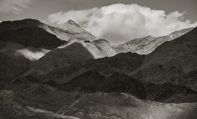
I loved the light on these mountains in Death Valley.
What I don't like in the picture:
In the above, the highest peak is bathed in light, but the lower right corner is not — at least not in this capture. Click on the above to see the subsequent capture that does have light in the lower right.
What I learned:
The composite image at left uses parts of both captures so as to reveal light on the topmost peak as well as that patch of light in the lower right. This also required the use of Generative fill in the lower left corder, a bit of cloning along the top edge and some careful blending. Multiple techniques to create an image that simply would not have been possible in earlier processes.
2nd Chances: What I might try next
This uses two images, so the pixel dimension are large — enough to print a 24" print. I think I will, just for fun. |
|


