Every Picture Is a Compromise
Lessons from the Also-rans
Most photography websites show the photographer's very best work. Wonderful. But that's not the full story of a creative life. If we want to learn, we'd better pay attention to the images that aren't "greatest hits" and see what lessons they have to offer. Every picture is a compromise — the sum of its parts, optical, technical, visual, emotional, and even cosmic – well, maybe not cosmic, but sometimes spiritual. Success on all fronts is rare. It's ok to learn from those that are not our best.
This is a series about my also-rans, some of which I've been able to improve at bit (i.e., "best effort"), none of which I would consider my best. With each there are lessons worth sharing, so I will.

Previous image | Next image |
Original digital capture

The Miracles of Technology Week
Transformation/Rectification
I've said for years that this is the best time in the history of photography to be a photographer. This week, I'll share an additional five "failures" that were rescued/improved by the miracles of software.
What I saw that I liked:
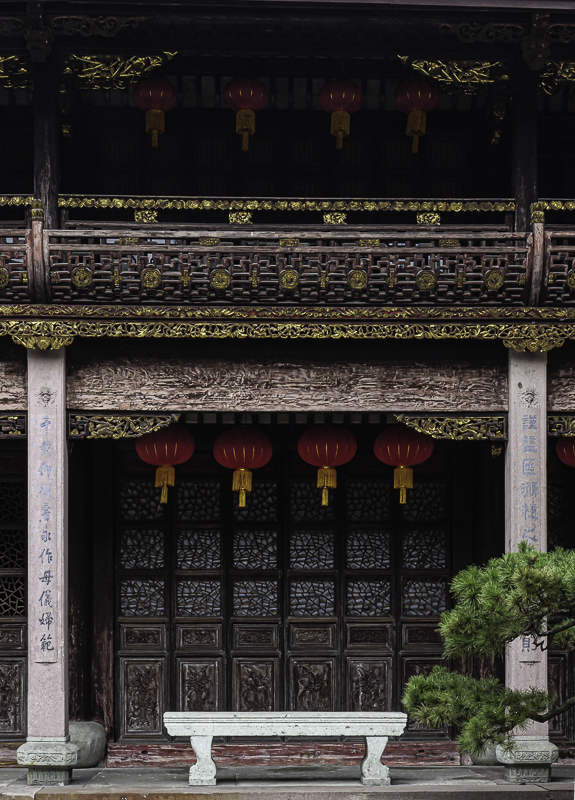
This is a fairly common scene in Chinese temples.
What I don't like in the picture:
Because I was pointing my camera slightly upwards, the two vertical columns appear to be converging inward. It was possible to fix this in the wet darkroom by tilting the paper easel and possibly the enlarger head, but what a hassle that was.
What I learned:
Software makes this kind of correct easy. The Transform Tool stretches the pixels in the entire image and to my eye looks perfectly natural while rectifying the vertical to be parallel to the edge of the image as well as to each other. I use this tool a lot. Misaligned verticals are especially bothersome when they are on the edge of the image.
2nd Chances: What I might try next
I need to pull more out of those upper shadows. |
|


