Every Picture Is a Compromise
Lessons from the Also-rans
Most photography websites show the photographer's very best work. Wonderful. But that's not the full story of a creative life. If we want to learn, we'd better pay attention to the images that aren't "greatest hits" and see what lessons they have to offer. Every picture is a compromise — the sum of its parts, optical, technical, visual, emotional, and even cosmic – well, maybe not cosmic, but sometimes spiritual. Success on all fronts is rare. It's ok to learn from those that are not our best.
This is a series about my also-rans, some of which I've been able to improve at bit (i.e., "best effort"), none of which I would consider my best. With each there are lessons worth sharing, so I will.
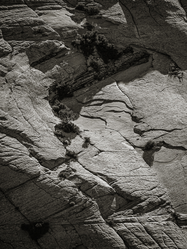
Original digital captureAbstract WeekIf you detest abstracts, please forgive me. I love them! I've made a long-term study of them. Making abstracts is a bit of a mystery, but there are a few ideas that can help. That is the focus of this week's EPIC images. Idea #3:Pattern versus eyeflowWhat I don't like in the picture:Abstracts are often composed of patterns, shapes, or lines. The above is all of that, but there isn't a subject. It's too simple to be a success abstract. What I learned:There is a difference between a simple pattern (like the above) and a composition that includes a flow or direction that guides our eye around the image. The image at left is also just a rock wall, but the circular eyeflow makes it a much more interesting image. 2nd Chances: What I might try nextWhy is this one an abstract? In my way of thinking, this leans toward the abstract because there isn't a well-defined subject. The "subject" is the shape of the composition, not really the rock or the vegetation. Said another way, this image would be just as successful if I were to rotate it 180°. The eyeflow would still be circular and the identifiable rock and bushes would just become meaningless shapes. |


