Every Picture Is a Compromise
Lessons from the Also-rans
Most photography websites show the photographer's very best work. Wonderful. But that's not the full story of a creative life. If we want to learn, we'd better pay attention to the images that aren't "greatest hits" and see what lessons they have to offer. Every picture is a compromise — the sum of its parts, optical, technical, visual, emotional, and even cosmic – well, maybe not cosmic, but sometimes spiritual. Success on all fronts is rare. It's ok to learn from those that are not our best.
This is a series about my also-rans, some of which I've been able to improve at bit (i.e., "best effort"), none of which I would consider my best. With each there are lessons worth sharing, so I will.
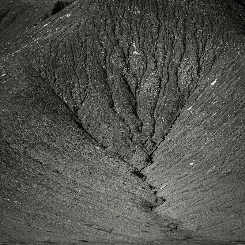
Original digital captureAbstract WeekIf you detest abstracts, please forgive me. I love them! I've made a long-term study of them. Making abstracts is a bit of a mystery, but there are a few ideas that can help. That is the focus of this week's EPIC images. Idea #2:ScaleWhat I don't like in the picture:My camera's native aspect ratio is 4:3, and so that is what I captured in the above image. I knew before making the exposure, however, that this would end up as a square image. The sky in the upper left corner had to go! What I learned:Why? By including the sky, the size of this hill is defined for us visually. Abstracts often let the scale of the object photographed remain a mystery. In fact, eliminating any sense of scale reference is one of the first steps in composing an abstract. An abstract requires our imagination. Facts are less important than feeling or mood. Cropping this image to eliminate the sky helps confuse the scale. 2nd Chances: What I might try nextNotice also that in the crop I eliminated that bush in the lower right. That also was an element that added a sense of scale to the image, so it had to go. |


