Every Picture Is a Compromise
Lessons from the Also-rans
Most photography websites show the photographer's very best work. Wonderful. But that's not the full story of a creative life. If we want to learn, we'd better pay attention to the images that aren't "greatest hits" and see what lessons they have to offer. Every picture is a compromise — the sum of its parts, optical, technical, visual, emotional, and even cosmic – well, maybe not cosmic, but sometimes spiritual. Success on all fronts is rare. It's ok to learn from those that are not our best.
This is a series about my also-rans, some of which I've been able to improve at bit (i.e., "best effort"), none of which I would consider my best. With each there are lessons worth sharing, so I will.
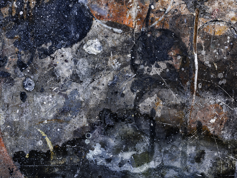
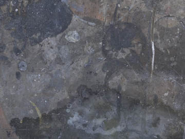
Original digital captureWhat I saw that I liked:I have no idea, but I love it. What I don't like in the picture:I know I'm running the risk of becoming repetitive, but this point is so important that I will bring it up again. COMPOSE IN THE FIELD, PROCESS FOR TONES. What I learned:The above image is an accurate representation of the grayish subject in flat, dull light. Nothing here — except all the tones and colors that can be pulled out with processing. The vibrant image at left is from the same digital capture as the blah image above. Notice I did nothing in the image at left that changes its cropping. I'd already done that in the field. 2nd Chances: What I might try nextThis is from a 12 megapixel camera, so natively it would make a 10x13 image at 300ppi. However, because it is a gritty abstract, I'll bet I could make 28" print at 144 ppi. I should try that, just for fun. |


