Every Picture Is a Compromise
Lessons from the Also-rans
Most photography websites show the photographer's very best work. Wonderful. But that's not the full story of a creative life. If we want to learn, we'd better pay attention to the images that aren't "greatest hits" and see what lessons they have to offer. Every picture is a compromise — the sum of its parts, optical, technical, visual, emotional, and even cosmic – well, maybe not cosmic, but sometimes spiritual. Success on all fronts is rare. It's ok to learn from those that are not our best.
This is a series about my also-rans, some of which I've been able to improve at bit (i.e., "best effort"), none of which I would consider my best. With each there are lessons worth sharing, so I will.
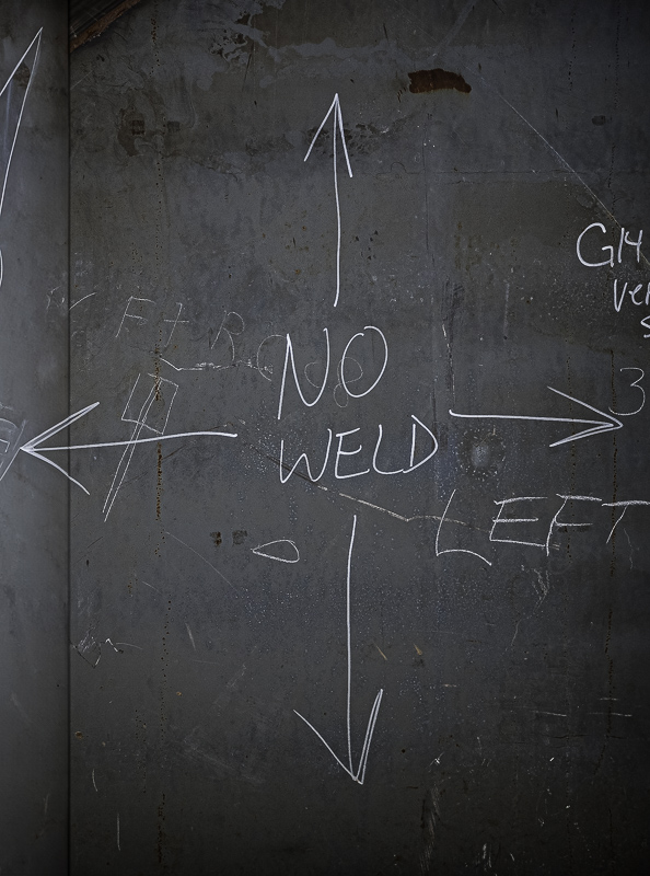
Original digital captureWhat I saw that I liked:A nice bilaterally symmetric bit of instruction for the welder at the Dakota Creek shipyard. What I don't like in the picture:The writing was bilaterally symmetric, but I missed it in my insensitive composition. What I learned:We all have a weakness. It is a good thing to know our weakness and work to overcome it. One of my chief weaknesses is the tendency to work too fast and to point the camera rather than to compose with the camera. How did I not see that I was cutting off the left arrow? For years this image has gathered dust in my digital archives. But now, using the new Generative Fill tool in Photoshop, I was able to recover from my idiocy and create the image that has escaped me for 14 years. 2nd Chances: What I might try nextThere are some very subtle colors in the sheet steel that might be able to be pulled out of the neutral gray. |


