Every Picture Is a Compromise
Lessons from the Also-rans
Most photography websites show the photographer's very best work. Wonderful. But that's not the full story of a creative life. If we want to learn, we'd better pay attention to the images that aren't "greatest hits" and see what lessons they have to offer. Every picture is a compromise — the sum of its parts, optical, technical, visual, emotional, and even cosmic – well, maybe not cosmic, but sometimes spiritual. Success on all fronts is rare. It's ok to learn from those that are not our best.
This is a series about my also-rans, some of which I've been able to improve at bit (i.e., "best effort"), none of which I would consider my best. With each there are lessons worth sharing, so I will.
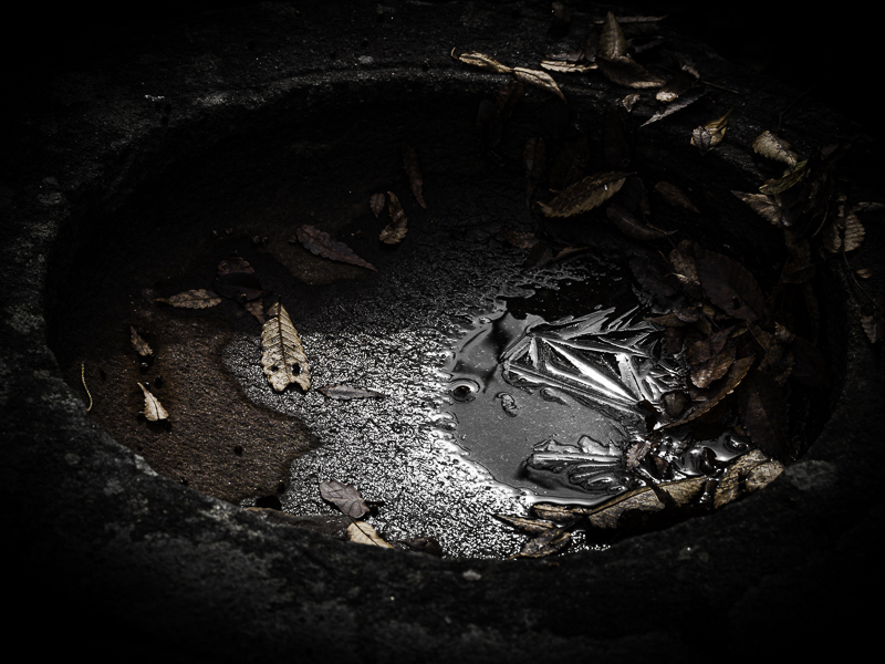
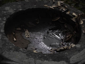
Original digital captureLittle FixesWhat I saw that I liked:This water bowl in a Japanese temple garden has a lovely shape. A bonus with the fall leaves. What I don't like in the picture:The above is pretty much the tones it had when viewing with my naked eye. Not very dramatic. And the near lip of the bowl is out of focus. What I learned:A simple fix for an image like this can be to radically change the tones of exposure in post-processing. The version at left had increased contrast and I darkened ther shadow quite a bit. Salvaged an otherwise mundane RAW capture. 2nd Chances: What I might try nextI could possibly punch up the color intensity of those fall leaves. |


