Every Picture Is a Compromise
Lessons from the Also-rans
Most photography websites show the photographer's very best work. Wonderful. But that's not the full story of a creative life. If we want to learn, we'd better pay attention to the images that aren't "greatest hits" and see what lessons they have to offer. Every picture is a compromise — the sum of its parts, optical, technical, visual, emotional, and even cosmic – well, maybe not cosmic, but sometimes spiritual. Success on all fronts is rare. It's ok to learn from those that are not our best.
This is a series about my also-rans, some of which I've been able to improve at bit (i.e., "best effort"), none of which I would consider my best. With each there are lessons worth sharing, so I will.
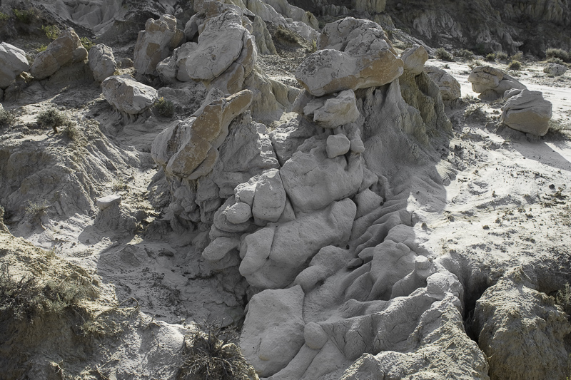
Original digital captureLittle FixesThis week I'll look at images that benefit from "little fixes" — small tweaks that are easy to overlook, but can dramatically improve an image. What I saw that I liked:I've looked at this image for years. Photographed in 2006. Something just isn't right. What I don't like in the picture:At last! I see it. It's the blue in the shadows, obviously coming from the blue sky overhead. Because the soil is basically white, it reflects the blue and creates this odd coloration that just doesn't feel natural. What I learned:The "little fix" for this image was to use the HSL sliders to remove blue from the image. 2nd Chances: What I might try nextIt's not a great composition, so I doubt I'll use this image anywhere, but at least I figure out how to get it to look more "normal" by removing that blue from the shadows. |


