Every Picture Is a Compromise
Lessons from the Also-rans
Most photography websites show the photographer's very best work. Wonderful. But that's not the full story of a creative life. If we want to learn, we'd better pay attention to the images that aren't "greatest hits" and see what lessons they have to offer. Every picture is a compromise — the sum of its parts, optical, technical, visual, emotional, and even cosmic – well, maybe not cosmic, but sometimes spiritual. Success on all fronts is rare. It's ok to learn from those that are not our best.
This is a series about my also-rans, some of which I've been able to improve at bit (i.e., "best effort"), none of which I would consider my best. With each there are lessons worth sharing, so I will.
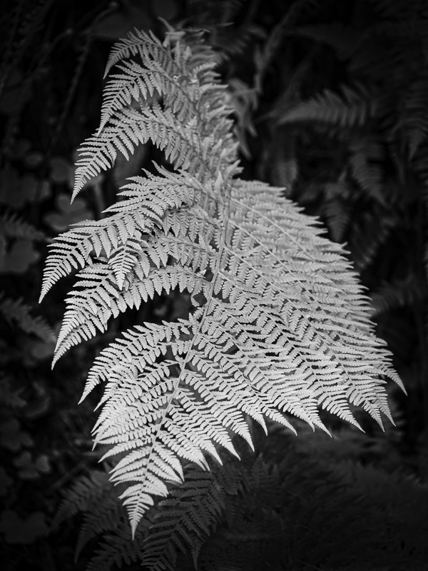
Original digital captureWhat I saw that I liked:I'm not so proud that I won't copy a Master's maserpiece. Ansel Adams did a silvery, shiny leaf image. I think it was a maple leaf, but I don't recall. What I don't like in the picture:With today's processing tools, getting that silvery, white leaf (in my case a fern) was easy. Too bad I didn't focus stack and get the entire fern in focus. It's especially bothersome that the tip at the bottom is out of focus. What I learned:Masterpiece photographs are so because they are harder to do than you might guess. After this failure, I now appriate the Adams' image even more. 2nd Chances: What I might try nextFind more ferns and try again. |


