Every Picture Is a Compromise
Lessons from the Also-rans
Most photography websites show the photographer's very best work. Wonderful. But that's not the full story of a creative life. If we want to learn, we'd better pay attention to the images that aren't "greatest hits" and see what lessons they have to offer. Every picture is a compromise — the sum of its parts, optical, technical, visual, emotional, and even cosmic – well, maybe not cosmic, but sometimes spiritual. Success on all fronts is rare. It's ok to learn from those that are not our best.
This is a series about my also-rans, some of which I've been able to improve at bit (i.e., "best effort"), none of which I would consider my best. With each there are lessons worth sharing, so I will.
|
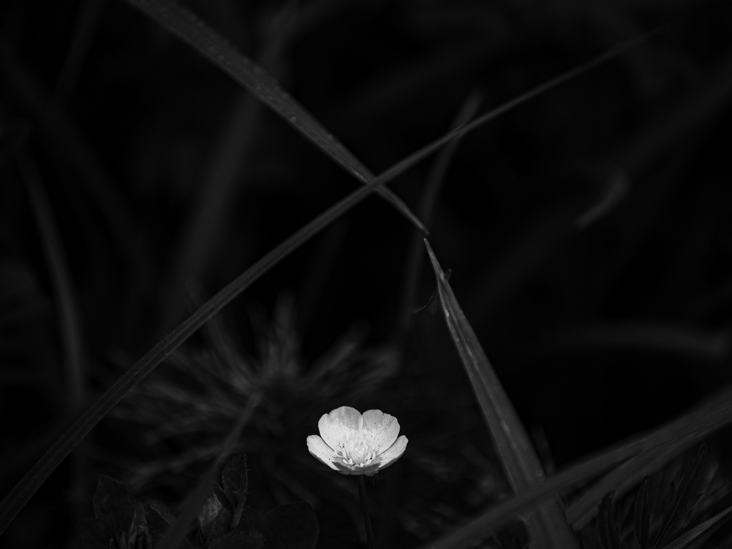
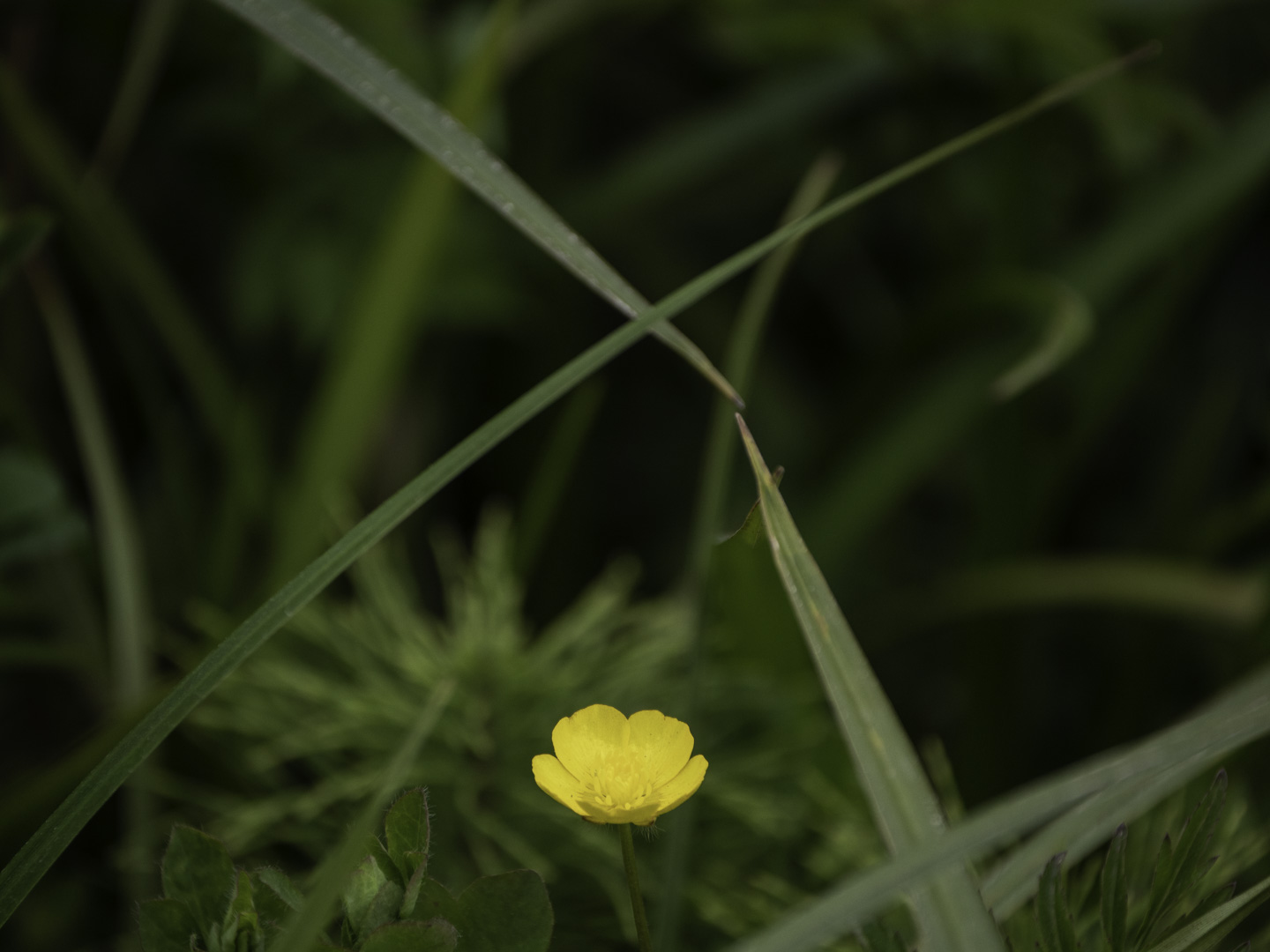
Original digital capture
What I saw that I liked:Intense, contrasting colors provide an idea opportunity of choice. Process as b/w or as color? What I don't like in the picture:I admit that I am biased. I spent the first 35 years of my creative life exclusively making b/w images. I've now learned to appreciate color work and I do quite a bit of it. But this particular subject — blossoms — always feel like botanical illustrations to me when they are a color photograph. I almost expect the caption to be its Latin name. Funny, I don't feel this way about other photographer's work, but I do about mine. What I learned:Those same intense, contrasting colors can also, however, be easily processed into powerful b/w images. I much prefer the rendition at left — which would have been far more difficult if the petal had been green, or the grass in the background yellow. I was able to push down the green to created those dark gray elements which make the now-white flower pop. 2nd Chances: What I might try nextMaybe this should be a mixed image with the background gray and the flower petal yellow? |