Every Picture Is a Compromise
Lessons from the Also-rans
Most photography websites show the photographer's very best work. Wonderful. But that's not the full story of a creative life. If we want to learn, we'd better pay attention to the images that aren't "greatest hits" and see what lessons they have to offer. Every picture is a compromise — the sum of its parts, optical, technical, visual, emotional, and even cosmic – well, maybe not cosmic, but sometimes spiritual. Success on all fronts is rare. It's ok to learn from those that are not our best.
This is a series about my also-rans, some of which I've been able to improve at bit (i.e., "best effort"), none of which I would consider my best. With each there are lessons worth sharing, so I will.
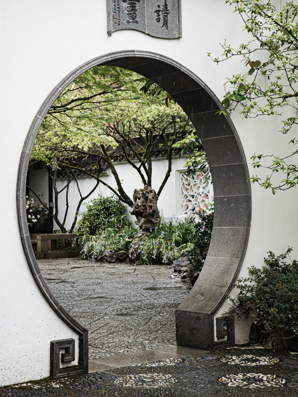
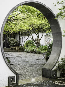
Original digital captureWhat I saw that I liked:Chinese garden round passageway What I don't like in the picture:Here's a dumb mistake. Notice how the left edge of the round doorway touches the edge of the photograph. Not good. But also not as I photographed it. What I learned:Click on the above image to see how I cropped the RAW file by rotating it to get the verticals to line up. In doing so, that left edge of the doorway moves closer to the edge of the picture, ruining the image. Fortunately, I knew I was flirting with danger, so I zoomed out a few millimeters and made a second images at left. That safety margin image salvaged what could have been a total loss. 2nd Chances: What I might try nextI wish I liked this image more than I do. It was a very flat, gray day and the picture looks like it. |


