Every Picture Is a Compromise
Lessons from the Also-rans
Most photography websites show the photographer's very best work. Wonderful. But that's not the full story of a creative life. If we want to learn, we'd better pay attention to the images that aren't "greatest hits" and see what lessons they have to offer. Every picture is a compromise — the sum of its parts, optical, technical, visual, emotional, and even cosmic – well, maybe not cosmic, but sometimes spiritual. Success on all fronts is rare. It's ok to learn from those that are not our best.
This is a series about my also-rans, some of which I've been able to improve at bit (i.e., "best effort"), none of which I would consider my best. With each there are lessons worth sharing, so I will.
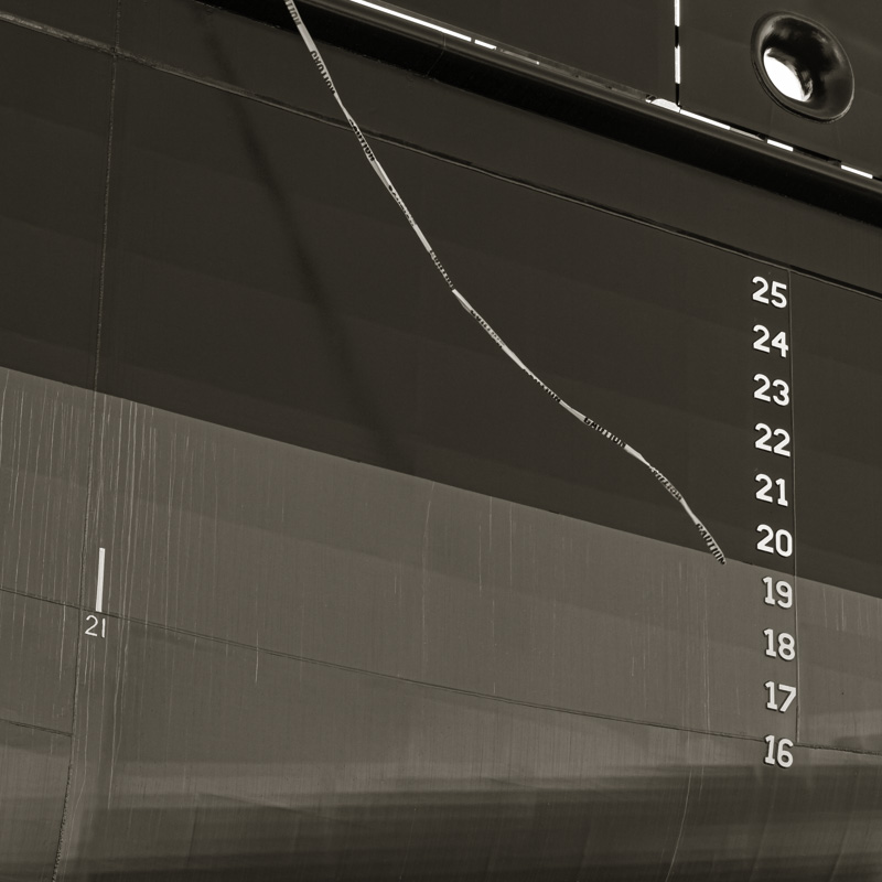
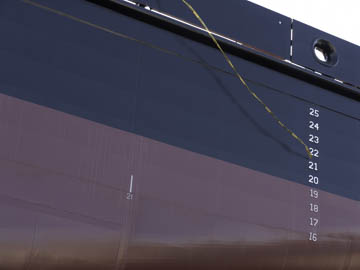
Original digital captureWhat I saw that I liked:From Dakota Creek Shipyard. The row of numbers is fun. The flying "caution" tape is fun. The tones are fun. What I don't like in the picture:That white corner in the upper right has got to go. Corners — damned corners. What I learned:I don't think I'm exaggerating if I state that 80% of composition is getting the corners right. Or fixing the corners in post. In this case, because the paint on the side of the hull was pretty much a solid color, I was able to paint in a bit of the corner to salvage something that's acceptable — not great, but I wouldn't hesitate using the image at left if I needed it. 2nd Chances: What I might try nextI wish I'd had the presence of mind to make an exposure with a longer shutter speed to introduce some movement into that "caution" tape. I wonder if I could do that in Photoshop? Worth a try. |


