Every Picture Is a Compromise
Lessons from the Also-rans
Most photography websites show the photographer's very best work. Wonderful. But that's not the full story of a creative life. If we want to learn, we'd better pay attention to the images that aren't "greatest hits" and see what lessons they have to offer. Every picture is a compromise — the sum of its parts, optical, technical, visual, emotional, and even cosmic – well, maybe not cosmic, but sometimes spiritual. Success on all fronts is rare. It's ok to learn from those that are not our best.
This is a series about my also-rans, some of which I've been able to improve at bit (i.e., "best effort"), none of which I would consider my best. With each there are lessons worth sharing, so I will.
|
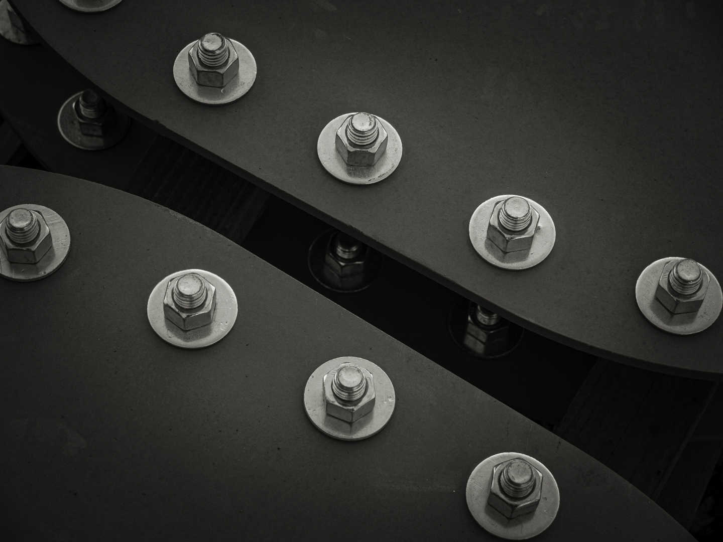
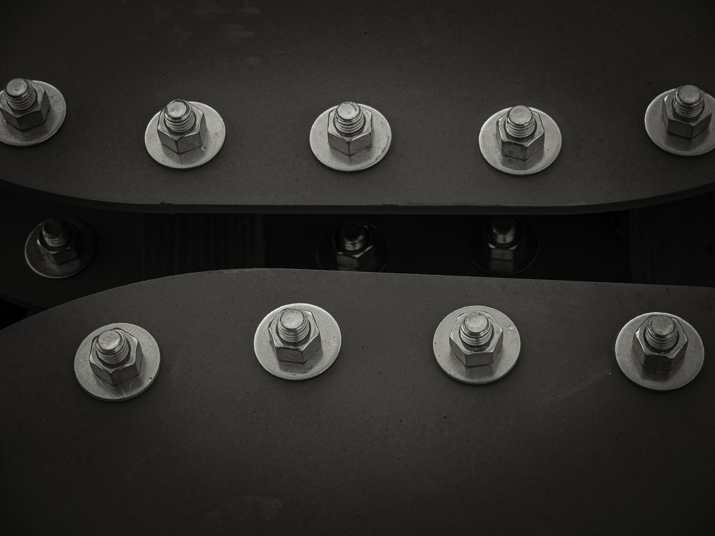
Original digital capture
What I saw that I liked:First, I think we can all agree that neither of these pictures is anything to write home about. A confirmed 0 for 2. That's not the point, however. What I don't like in the picture:The point is one of composition. Which image feels more dynamic, more engaging, more "alive"? I've processed these two exacty the same tones. The only difference is the horizontal composition above compared to the diagonal composition at left. What I learned:Rectilinear lines (up/down, left/right) are static, stable, solid, unmoving. Sometimes that's exactly what you want. Diagonal lines have movement, direction, rhythm, life. Sometimes that's exactly what you want. The trick is knowing which is the right alignment for the subject and your intentions. Neither of these is "right" or "wrong" — but they are different. In fact, sometimes I just miss it completely. Severe cropping can sometimes create a rectilinear out of a diagonal or a diagonal out of a rectilinear. Better to get is right in the field, but I've salvaged many an image by converting it from one to the other or vice versa. |