Every Picture Is a Compromise
Lessons from the Also-rans
Most photography websites show the photographer's very best work. Wonderful. But that's not the full story of a creative life. If we want to learn, we'd better pay attention to the images that aren't "greatest hits" and see what lessons they have to offer. Every picture is a compromise — the sum of its parts, optical, technical, visual, emotional, and even cosmic – well, maybe not cosmic, but sometimes spiritual. Success on all fronts is rare. It's ok to learn from those that are not our best.
This is a series about my also-rans, some of which I've been able to improve at bit (i.e., "best effort"), none of which I would consider my best. With each there are lessons worth sharing, so I will.
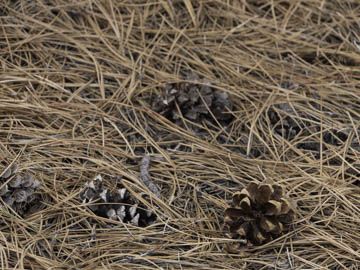
Original digital captureWhat I saw that I liked:The forest floor is always interesting. What I don't like in the picture:I don't like that the top 80% of the picture is out of focus because I botched the depth of field. Hence the attempt to salvage it witha pano crop at left. What I learned: . . . or in this case, what I haven't learned. Or I keep forgetting and having to relearn: Pointing the camera down at a 45° angle to the ground — in combination with a fairly close object distance — creates a much shallower depth of field than 2nd Chances: What I might try nextIs it asking too much to just remember that this type of photograph almost always requires focus stacking? God, I miss my tilting view camera for instances like this. |


