Every Picture Is a Compromise
Lessons from the Also-rans
Most photography websites show the photographer's very best work. Wonderful. But that's not the full story of a creative life. If we want to learn, we'd better pay attention to the images that aren't "greatest hits" and see what lessons they have to offer. Every picture is a compromise — the sum of its parts, optical, technical, visual, emotional, and even cosmic – well, maybe not cosmic, but sometimes spiritual. Success on all fronts is rare. It's ok to learn from those that are not our best.
This is a series about my also-rans, some of which I've been able to improve at bit (i.e., "best effort"), none of which I would consider my best. With each there are lessons worth sharing, so I will.
Previous image | Next image |
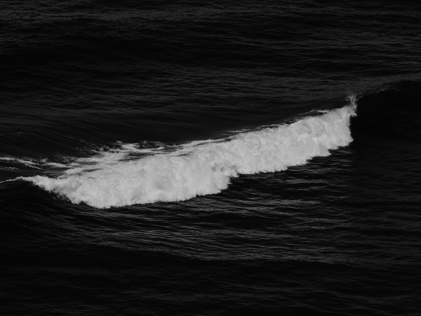
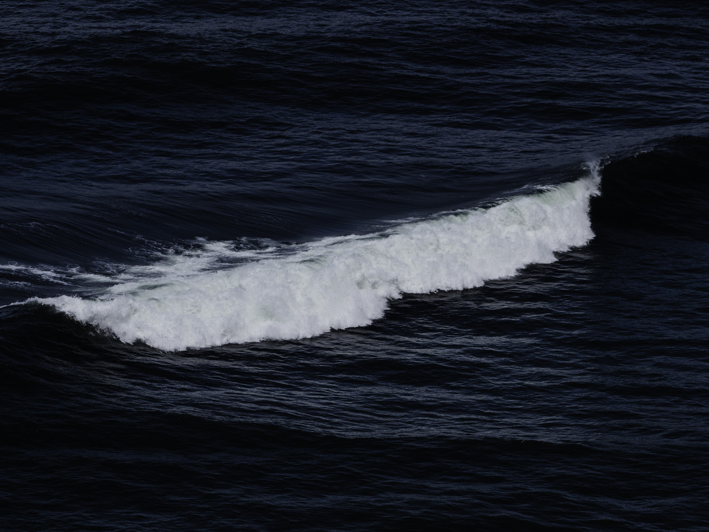
Original digital capture
What I saw that I liked:The dark swells giving contrast to the bright-white crashing wave. What I don't like in the picture:Color or b/w? B/W or color? Back and forth, back and forth I flip and just can't decide. What I learned:One of the most fundamental processing decisions I now find myself faced with in ever-so-many pictures is the question of color or b/w. Life was s much simpler in the days of film. So how does one decide in today's digital world? I've concluded that the project decides. That is to say, looking at an image like this one and trying to decide color or b/w is premature. I can't make that decision until I know how the image is being used in a project. Both choices are right if it fits the project. Both choices are wrong if it doesn't blend with the other images in the project. Same could be said of toning and all other processing decisions. Context is the deciding factor. |