Every Picture Is a Compromise
Lessons from the Also-rans
Most photography websites show the photographer's very best work. Wonderful. But that's not the full story of a creative life. If we want to learn, we'd better pay attention to the images that aren't "greatest hits" and see what lessons they have to offer. Every picture is a compromise — the sum of its parts, optical, technical, visual, emotional, and even cosmic – well, maybe not cosmic, but sometimes spiritual. Success on all fronts is rare. It's ok to learn from those that are not our best.
This is a series about my also-rans, some of which I've been able to improve at bit (i.e., "best effort"), none of which I would consider my best. With each there are lessons worth sharing, so I will.
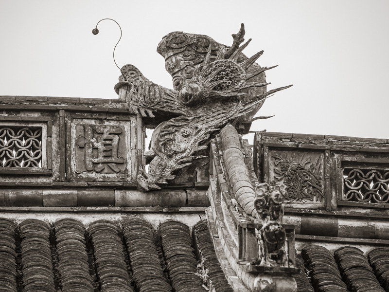
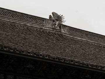
Original digital captureWhat I saw that I liked:There were several dragon-head sculputures on the roof line of this temple. What I don't like in the picture:Although the above puts the dragon in context of the roof, it's too small to see the details that are so interesting. What I learned:In the second composition, the nearest details are out of focus. Zero for two. Besides, all that white sky is really boring. This is a good example of why travel photography is such a matter of luck. If I'd happen to have been there on a day of sunshine, I might have had more luck. 2nd Chances: What I might try nextMaybe I could make my own sunshine? |


