Every Picture Is a Compromise
Lessons from the Also-rans
Most photography websites show the photographer's very best work. Wonderful. But that's not the full story of a creative life. If we want to learn, we'd better pay attention to the images that aren't "greatest hits" and see what lessons they have to offer. Every picture is a compromise — the sum of its parts, optical, technical, visual, emotional, and even cosmic – well, maybe not cosmic, but sometimes spiritual. Success on all fronts is rare. It's ok to learn from those that are not our best.
This is a series about my also-rans, some of which I've been able to improve at bit (i.e., "best effort"), none of which I would consider my best. With each there are lessons worth sharing, so I will.
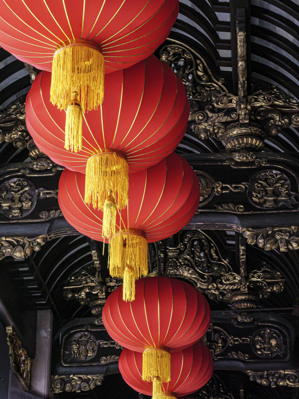
Original digital captureWhat I saw that I liked:These red "prosperity" lanterns are everywhere in China. What I don't like in the picture:Somewhere — I no long remember where — I read about one of the principle concepts of graphic design: use odd numbers, not even ones. Better to have 3 items rather than 4, etc. I have no idea why this is so, but I've found it to be true. The two lanterns above are just not right. At least the tassles aren't twirling. Ahem. What I learned:The image at left has an odd number of lanterns and works much better. Sure, the vertical, descneding line helps guide our eye, too, but the odd number just seems more balanced. 2nd Chances: What I might try nextActually, I'm pretty happy with the one on the left. I have a lot more images of these and I should see if I have enough interesting ones for a small project. |


