Every Picture Is a Compromise
Lessons from the Also-rans
Most photography websites show the photographer's very best work. Wonderful. But that's not the full story of a creative life. If we want to learn, we'd better pay attention to the images that aren't "greatest hits" and see what lessons they have to offer. Every picture is a compromise — the sum of its parts, optical, technical, visual, emotional, and even cosmic – well, maybe not cosmic, but sometimes spiritual. Success on all fronts is rare. It's ok to learn from those that are not our best.
This is a series about my also-rans, some of which I've been able to improve at bit (i.e., "best effort"), none of which I would consider my best. With each there are lessons worth sharing, so I will.
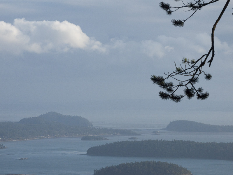
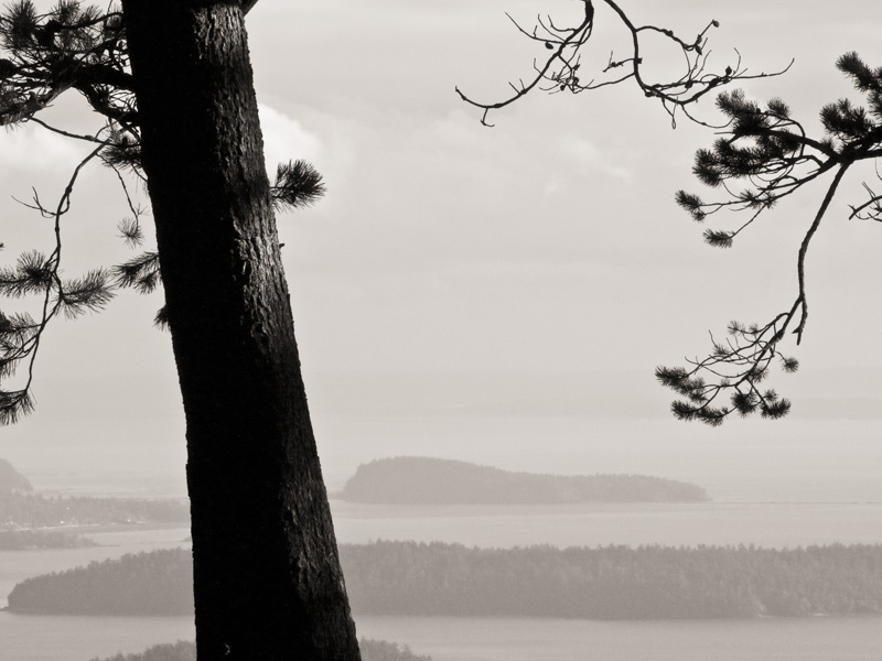
Original digital captureWhat I saw that I liked:All that air. But, how do you photograph just air? What I don't like in the picture:Clearly, the first attempt above doesn't work because the air just isn't there. We sense it as just empty space, but space and air are two different things. So, I tried using the branch from the tree next to me to add depth to the scene, but the branch is out of focus. This one isn't any better. In fact, I think it's worse. What I learned:Don't give up. Finally, I tried the one at left and focussed on the tree trunk. It's still not a photograph of air, but I think this one works better to express the space our there beyond the tree. 2nd Chances: What I might try nextWhat if I made that distant island lighter so it looked even more shrouded in mist? Would that add an extra sense of three-dimensionality? |


