Every Picture Is a Compromise
Lessons from the Also-rans
Most photography websites show the photographer's very best work. Wonderful. But that's not the full story of a creative life. If we want to learn, we'd better pay attention to the images that aren't "greatest hits" and see what lessons they have to offer. Every picture is a compromise — the sum of its parts, optical, technical, visual, emotional, and even cosmic – well, maybe not cosmic, but sometimes spiritual. Success on all fronts is rare. It's ok to learn from those that are not our best.
This is a series about my also-rans, some of which I've been able to improve at bit (i.e., "best effort"), none of which I would consider my best. With each there are lessons worth sharing, so I will.
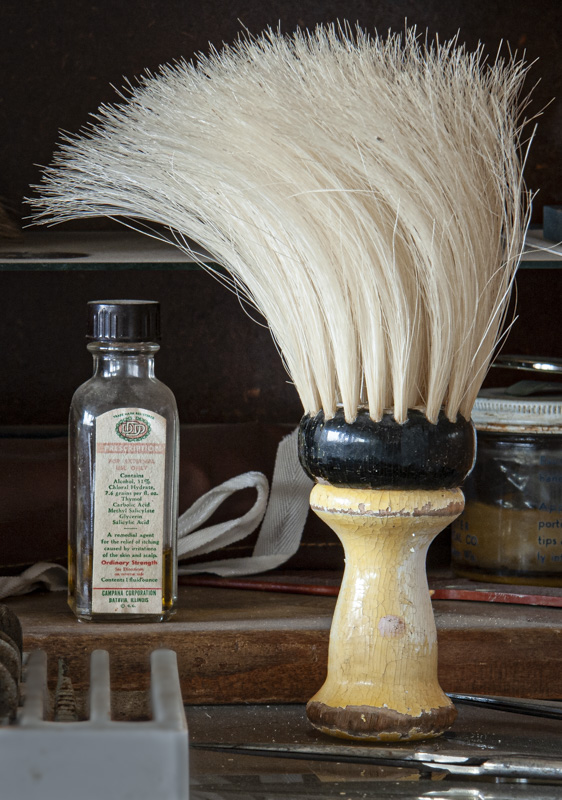
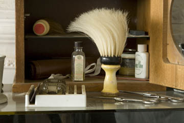
Original digital captureWhat I saw that I liked:The barber's brush, the barber's brush, the barber's brusk. What I don't like in the picture:Then why did I include all the rest of that crap in the composition? Man, do I detest it when I miss a great potential image this badly. What I learned:I've trid to salvage the essence of this with some extreme cropping, but that whatever-it-is in the lower left corner just bugs me. 2nd Chances: What I might try nextI might just move this one over to Photoshop and try to completely get rid of that lower left object. Maybe the new magical "Sky Replacement" tool will work. Nah, probably not. How easy it would have been to just physically move it out of the composition! Live and learn. |


