Every Picture Is a Compromise
Lessons from the Also-rans
Most photography websites show the photographer's very best work. Wonderful. But that's not the full story of a creative life. If we want to learn, we'd better pay attention to the images that aren't "greatest hits" and see what lessons they have to offer. Every picture is a compromise — the sum of its parts, optical, technical, visual, emotional, and even cosmic – well, maybe not cosmic, but sometimes spiritual. Success on all fronts is rare. It's ok to learn from those that are not our best.
This is a series about my also-rans, some of which I've been able to improve at bit (i.e., "best effort"), none of which I would consider my best. With each there are lessons worth sharing, so I will.
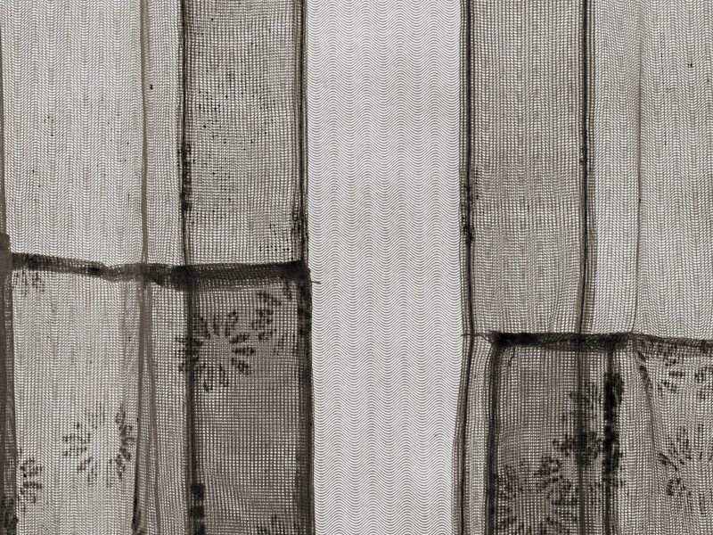
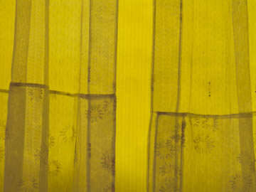
Original digital captureWhat I saw that I liked:Nostalgia on parade. Reminded me of the lace curtains in my grandmother's log cabin in Wyoming. What I don't like in the picture:Clearly a white balance issue, but beyond that it's just a bit too, well, planar. It was back-illuminated, but it sure doesn't feel that way in this original rendition. What I learned:By turning it into a monochromatic image, I cleaned up the white balance issue, but now I think it is more abstract. The sine wave pattern in the middle is cool, but makes it look less nostalgic and more "oscilloscopy." 2nd Chances: What I might try nextSorta stuck on this one. I guess I'll need to let it percolate some more to see if any good ideas pop out of my subconscious. |


