Every Picture Is a Compromise
Lessons from the Also-rans
Most photography websites show the photographer's very best work. Wonderful. But that's not the full story of a creative life. If we want to learn, we'd better pay attention to the images that aren't "greatest hits" and see what lessons they have to offer. Every picture is a compromise — the sum of its parts, optical, technical, visual, emotional, and even cosmic – well, maybe not cosmic, but sometimes spiritual. Success on all fronts is rare. It's ok to learn from those that are not our best.
This is a series about my also-rans, some of which I've been able to improve at bit (i.e., "best effort"), none of which I would consider my best. With each there are lessons worth sharing, so I will.
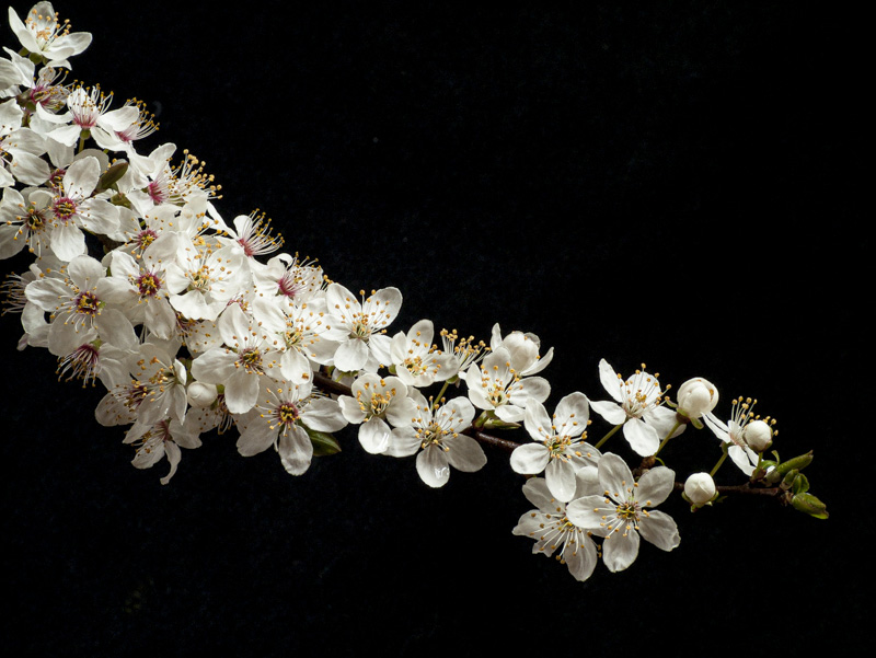
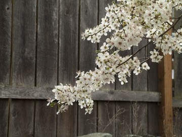
Original digital captureWhat I saw that I liked:The vibrancy of life in full bloom! What I don't like in the picture:The vibrancy of fence. Clearly, we have a background problem here. What I learned:I trimmed off a branch and brought it into the studio to try to set up a controlled background in a windless environment. It worked, but a solid black background seems a bit like a cheat. Too easy. Or is this just some sort of artistic self-flagellation? I like this image, but I've never used it anywhere other than here. 2nd Chances: What I might try nextPerhaps I find this image unsatisfying because it doesn't feel like I'm making an artistic statement. "Here is a blossom. Enjoy." Just doesn't seem very insightful nor require an artist to make this observation. |


