Every Picture Is a Compromise
Lessons from the Also-rans
Most photography websites show the photographer's very best work. Wonderful. But that's not the full story of a creative life. If we want to learn, we'd better pay attention to the images that aren't "greatest hits" and see what lessons they have to offer. Every picture is a compromise — the sum of its parts, optical, technical, visual, emotional, and even cosmic – well, maybe not cosmic, but sometimes spiritual. Success on all fronts is rare. It's ok to learn from those that are not our best.
This is a series about my also-rans, some of which I've been able to improve at bit (i.e., "best effort"), none of which I would consider my best. With each there are lessons worth sharing, so I will.
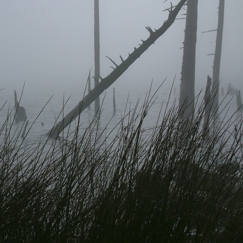
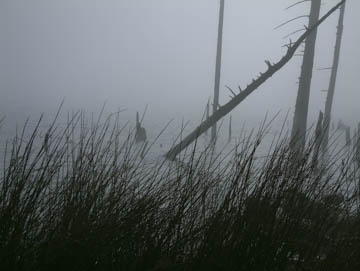
Original digital captureWhat I saw that I liked:Bare trees in fog. Like candy to a baby. Can't resist. What I don't like in the picture:Evidently, I also can't compose. Everything is too far to the right and leaning out of the frame. I must have bumped the tripod. Yeah, that's it. Certainly couldn't be my insensitivity to compositional basics, nope. What I learned:Pointing and composing are not the same thing. Looking back through my Lightroom catalog, this is by far my most prevalent error. I think this is related to my inability to see the three-dimensional world in two-dimensions. Just never been very good at it. 2nd Chances: What I might try nextThis image is from very early in my foray into digital photography. At that point, I was struggling with the tiny LCD screen on the camera and it shows in this image. |


