Every Picture Is a Compromise
Lessons from the Also-rans
Most photography websites show the photographer's very best work. Wonderful. But that's not the full story of a creative life. If we want to learn, we'd better pay attention to the images that aren't "greatest hits" and see what lessons they have to offer. Every picture is a compromise — the sum of its parts, optical, technical, visual, emotional, and even cosmic – well, maybe not cosmic, but sometimes spiritual. Success on all fronts is rare. It's ok to learn from those that are not our best.
This is a series about my also-rans, some of which I've been able to improve at bit (i.e., "best effort"), none of which I would consider my best. With each there are lessons worth sharing, so I will.
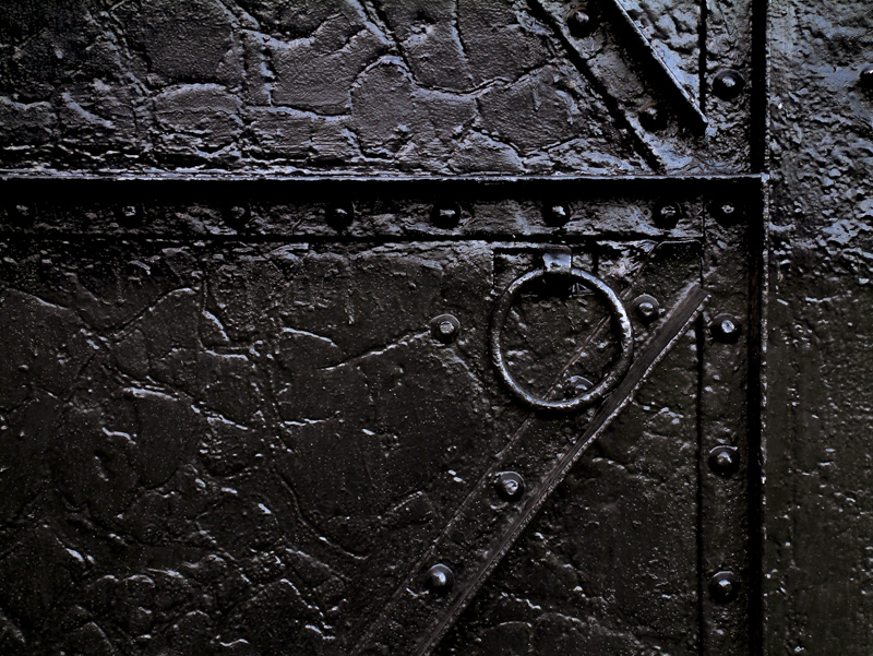
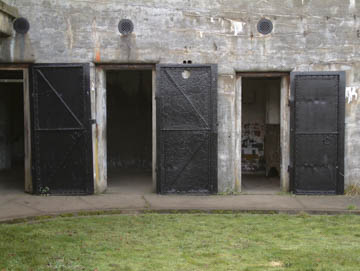
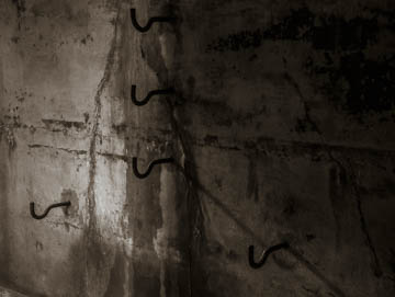
Original digital captureWhat I saw that I liked:A symmetry and repeating pattern. What I don't like in the picture:This is at the old WWI artillery battery called Fort Casey. Out of context, this picture is pretty meaningless. Even in context, it's just not a picture that does much. Too centered, too distant, too sloppy. What I learned:I thought that by getting closer and concentrating on a detail that it would work. The photo at left shows I was wrong. Mere geometry. Something is still missing. 2nd Chances: What I might try nextThis place is not so much a "place" as it is a mood. Next time I'm back there, I need to think more about how it feels and less about how it looks. The image below is closer to the mark. Still not great but at least it's creepy.
|


