Every Picture Is a Compromise
Lessons from the Also-rans
Most photography websites show the photographer's very best work. Wonderful. But that's not the full story of a creative life. If we want to learn, we'd better pay attention to the images that aren't "greatest hits" and see what lessons they have to offer. Every picture is a compromise — the sum of its parts, optical, technical, visual, emotional, and even cosmic – well, maybe not cosmic, but sometimes spiritual. Success on all fronts is rare. It's ok to learn from those that are not our best.
This is a series about my also-rans, some of which I've been able to improve at bit (i.e., "best effort"), none of which I would consider my best. With each there are lessons worth sharing, so I will.
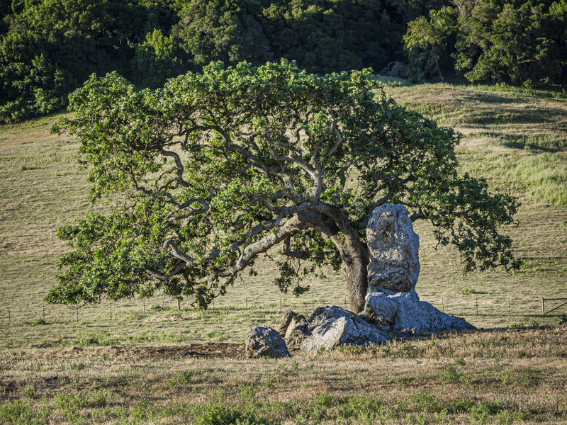
Original digital captureWhat I saw that I liked:Lovely shape to the tree; lovely rock nuzzled up to the tree; beautiful morning light. Lovely, lovely, lovely... What I don't like in the picture:...except for that damned merge between the top of the tree and the distant trees in the background. What I learned:A classic example of needing to photograph from the roof of the car, like Ansel Adams did. If the top of that tree were seen in contrast against the dry grasses in the field, this would really work better. As it is, not so much. 2nd Chances: What I might try nextThis is an example of why I've said one of my most valuable photographic accessories is my two-foot step ladder. Unfortunately, I was traveling and it would have looked silly to carry a step ladder with me on the airplane. Oh, well, another "close, but no cigar" image. |


