Every Picture Is a Compromise
Lessons from the Also-rans
Most photography websites show the photographer's very best work. Wonderful. But that's not the full story of a creative life. If we want to learn, we'd better pay attention to the images that aren't "greatest hits" and see what lessons they have to offer. Every picture is a compromise — the sum of its parts, optical, technical, visual, emotional, and even cosmic – well, maybe not cosmic, but sometimes spiritual. Success on all fronts is rare. It's ok to learn from those that are not our best.
This is a series about my also-rans, some of which I've been able to improve at bit (i.e., "best effort"), none of which I would consider my best. With each there are lessons worth sharing, so I will.
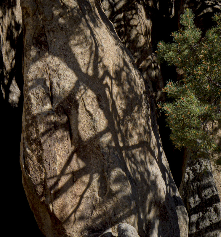
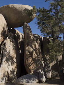
Original digital captureWhat I saw that I liked:The balanced rock is what caught my attention, so I set out to make a picture of it. What I don't like in the picture:The balanced rock is not the most interesting thing in the picture. The tree shadow is where the visual interest lies. What I learned:Sometimes the first thing you see is not the best thing to see. 2nd Chances: What I might try nextI've played around with this image quite a bit and am ready to give up on it. I'm not, however, ready to give up on the idea of tree shadows. I just need to get out there and try some more ideas to find something that works on a two-dimensional visual plane — at least better that this sorry attempt does. |


