Every Picture Is a Compromise
Lessons from the Also-rans
Most photography websites show the photographer's very best work. Wonderful. But that's not the full story of a creative life. If we want to learn, we'd better pay attention to the images that aren't "greatest hits" and see what lessons they have to offer. Every picture is a compromise — the sum of its parts, optical, technical, visual, emotional, and even cosmic – well, maybe not cosmic, but sometimes spiritual. Success on all fronts is rare. It's ok to learn from those that are not our best.
This is a series about my also-rans, some of which I've been able to improve at bit (i.e., "best effort"), none of which I would consider my best. With each there are lessons worth sharing, so I will.
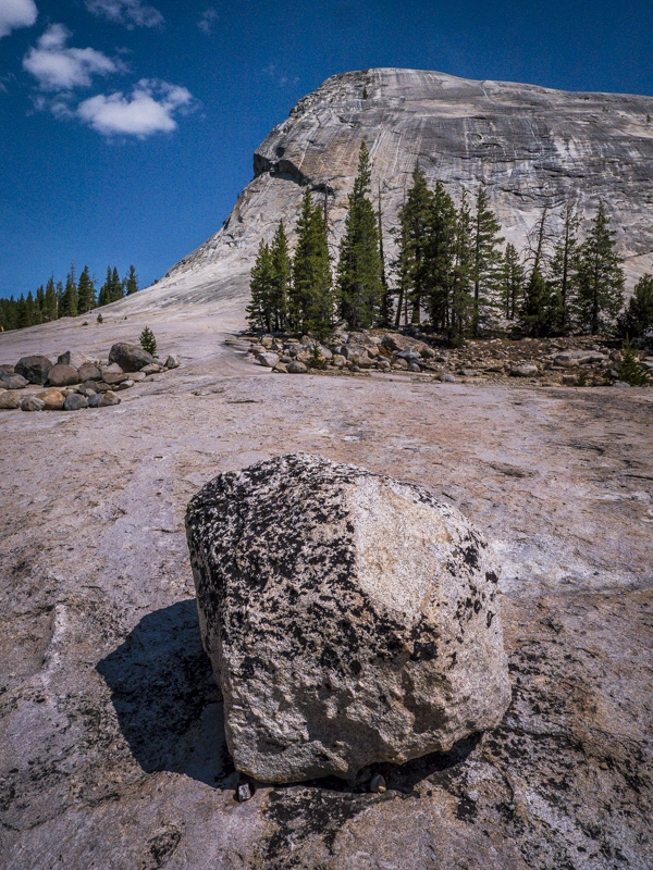
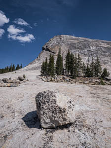
Original digital captureWhat I saw that I liked:I'm still trying to refine my use of an ultra-wide in the landscape. I'm trying to think of them as "ultra-deep" focal lengths. I think I had a good idea with this one, but with the first version (above) I didn't push it far enough. What I don't like in the picture:Too much sky. I could crop, but the better answer was to step closer. See the image to the left. What I learned:Compare the geometries of the near boulder in these two images. They are quite a bit different. Ultra-wides do some strange things to the geometry of perspective — and that is their strength. 2nd Chances: What I might try nextI think this image needs some cloud shadows. Next, I'll try a little burning here and there to create them. And I've got to get that blue in the sky right. It's currently a bit too cyan. |


