Every Picture Is a Compromise
Lessons from the Also-rans
Most photography websites show the photographer's very best work. Wonderful. But that's not the full story of a creative life. If we want to learn, we'd better pay attention to the images that aren't "greatest hits" and see what lessons they have to offer. Every picture is a compromise — the sum of its parts, optical, technical, visual, emotional, and even cosmic – well, maybe not cosmic, but sometimes spiritual. Success on all fronts is rare. It's ok to learn from those that are not our best.
This is a series about my also-rans, some of which I've been able to improve at bit (i.e., "best effort"), none of which I would consider my best. With each there are lessons worth sharing, so I will.
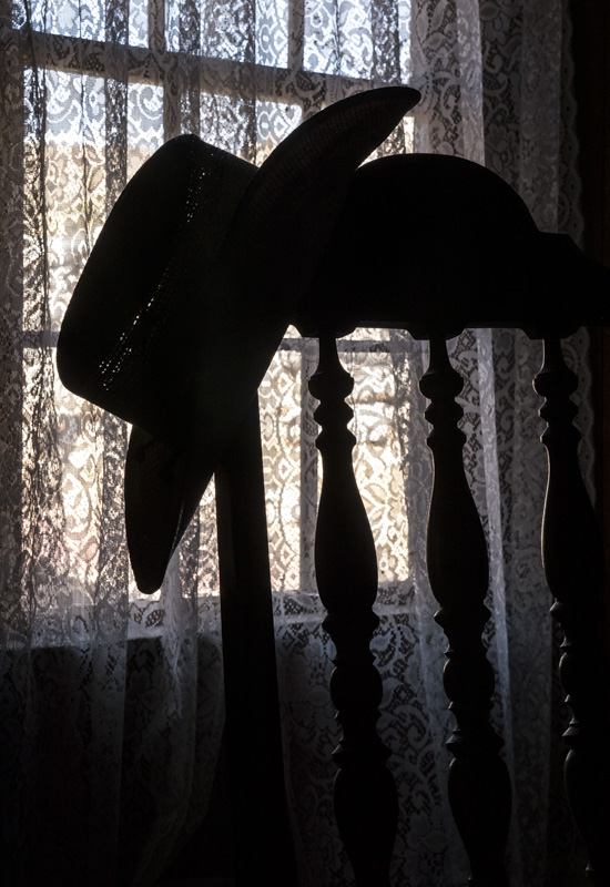
Original digital captureWhat I saw that I liked:Obviously, the silhouette is what makes this image. Fortunate that the chair has spindle shapes in the rungs. Lacy curtain a nice touch, too. What I don't like in the picture:With all that black frame to the left of the window, why oh why did I feel it was necessary to cut the top right of the chair in half? Talk about a bonehead mistake! What I learned:I'm a stickler for edges and corners in my prints and finished images. If I were only that conscious of edges and corners when I'm composing in the field. I must have accidentally kicked the leg of my tripod. My story, and I'm sticking to it. 2nd Chances: What I might try nextI'll try to crop out the right side to completely eliminate that top decoration. Too bad, but hopefully better than nothing. |


